Saturday, 7 December 2013

Three hot colours for 2014

Radiant Orchid is PANTONE's colour for 2014 and
"encourages expanded creativity and originality".
A soft blue, a luminous purple and a mellow yellow. These are the colours we should use in our homes next year, if we are to follow the advice from three big paint companies. 

The first two colours are cool, whereas the yellow has a warm glow to it. The purple stands out in this crowd because of its vibrancy.


CIL's Creamy, described as a “soft,
buttery colour that emits a feeling
of calm, tranquility and renewal.”

I would use the purple as an accent colour in accessories, and possibly a focal wall, but can't really see it on all the walls of a room. Can you? 

The pastel blue I'll keep as a contender for a bedroom or a bathroom. 

The yellow will cheer up any room. It's the most versatile of the three. Paired with black and grey, it feels fresh and more contemporary than the French country style that this hue is often associated with.

What do you think, will you try any of these colours next year?


Benjamin Moore's Breath of Fresh Air 806 is
described as a "new neutral", that works in
several different environments.
CIL's "Creamy" paired with greys, whites and black.

Sunday, 1 December 2013

Dreaming of a white Christmas

Tulips in December? That's an early start, but I'll
take it, thanks to the Metro store in North Bay
and my thoughtful husband. Whether we'll have
a white Christmas or not, I know my home will
be partly dressed in white for the holidays.
Winter is off to a flying start! At the rate we're going, there's a good chance we'll have a white Christmas.

Will that be true also for the interiors of our homes? Not so sure; the traditional red and green, gold, silver, and to some extent icy blue, continue to be the go-to colours this time of the year. 

I have always liked the idea of a white Christmas. I know, it's not warm and cozy, and it doesn't fit all interiors. But paired with the greenery of the tree, pine cones and wood, it feels so airy, fluffy and light - just like snow. And: it's hard to get tired of!

The colour injection can come from other things, such as food, beverages, porcelain and napkins.

Be inspired by these white Christmas interiors from the company Bemz:


Sunday, 24 November 2013

Simply Christmas

Christmas is in full swing - at least in our stores and decorating magazines.

It's easy to get stressed out about the holidays, but my advice is: don't fret it! After all, much more  important than "the perfectly decorated home" - if there is such thing - is the opportunity to enjoy the season with family and friends. Really!

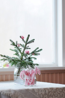
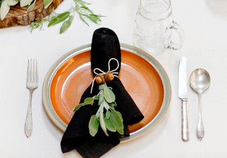
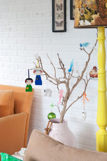
As a tribute to my relaxed, "simply Christmas" philosophy, here are a few easy decorating ideas, done with a twinkle in the eye.


Photo: HouzzOther Metro Media &
Bloggers Kootut murut

.


Areaware's Infinite tree stands 17" high and can
take on three cool looks.
 
 
Photo: Sköna Hem. "New take" on the traditional
Poinsettia. This is an easy one to copy!
 
A 3D Christmas calendar, with a surprise for every day.
    
Photo: Houzz. Photographers Rikki Snyder.
 

Photo: Houzz. Planet Fur.
 

Sunday, 17 November 2013

Bright ideas for lighting

Soon our homes will be filled with sparkling, light-filled Christmas trees, soft candles and illuminated decorations. The additional light sources will give our homes a layered, cozy feeling that is easily missed once the holidays are over.

But what if we apply some of the principles of Christmas decorating, in particular those that pertain to lighting, also the rest of the year? Here are three ways to do exactly that:

1) Assess the light bulbs in your existing fixtures. Do they give off a cool white or a warm yellow light? You can drastically change the whole appearance and feeling of a room by replacing a whitish bulb with a warmer, yellower version. As clients of mine have experienced, it can save you from having to repaint the room, or having to change upholstery and area rugs.

2) A layered lighting scheme is based on variation in the height and direction of the light sources. You can achieve amazing improvements simply by replacing a floor lamp by a table lamp, or by using pendant lights as reading lamps next to the bed, instead of the more typical wall sconces. Whether it'll work or not, depends on the height of the surrounding furniture and on the other light sources in the room.

3) Christmas lights are all about low-intensity accent lighting. Get the same result the rest of the year by having dimmers on the main light sources; by using products such as LED strips for in-cabinet and under-cabinet lighting; and by illuminating interesting features in your home. When buying light bulbs, make sure they are actually dimmable - not all of them are.

With these easy and affordable measures, our homes will feel warm and inviting all year round. Isn't that a bright idea?

Sunday, 10 November 2013

Break the chair monopoly

Photo: Architectural Digest.
Are you happy with your dining room furniture? I find that many homeowners aren't, and that the problem often is the setup. There are simply too many chairs around the table, and they all look the same. The result can feel static and sometimes boring.

If this is your situation, and if you have a rectangular table, then try this: rather than changing all the chairs, switch out only the end chairs. It will instantly bring new life into your dining room. 

For example, you can mix up your row of upholstered chairs with a more sculptural, airy style like in the photo on the left. Or you can have slipcovers made for your existing end chairs, and introduce some variety that way.

Photo: House Beautiful


Another popular solution is to mix benches and banquettes with the chairs, for a flexible and relaxed vibe. I'm pretty sure our dining rooms would be used a lot more if we lost a bit of their formality. What do you think?

Remember my special price of $25 for a one-hour appointment in November? Book your appointment now if you too want to feel good every time you walk into your space.


Sunday, 3 November 2013

Looking at art from the start


"And what should go on this wall?" The question comes up all the time during my consultations. A space just doesn't feel complete if there is a blank wall.

I like to look at artwork early on in a decorating project, because it can give important clues as to what colours to use, and what style of furniture to buy. If you leave art to the last, when the upholstered pieces, rugs, window treatment and so on are already in, it can be difficult to find "that right piece" for the room.

And here's another important aspect: you should love what you put on your walls, especially if it's a focal wall. After all, you're going to look at it every day for many years. 

With this in mind, I suggest visiting our local art galleries for unique pieces that will give your home a personal, original flavour.

For an affordable piece of original artwork, one idea is to select one of your favourite photos - or take a photograph specifically for the space you have in mind - and have it enlarged and printed on a canvas.

For more tips on inexpensive art, check out my previous blog posts Getting the hang of art and A flexible approach to art.
Here's a perfect example of decorating around art, and the importance
of art. This room by Sarah Richardson gets its punch through the artwork,
which is reinforced by the matching ottoman. Photo: Sarah Richardson

Monday, 28 October 2013

Show off your stripes!


Striped rug from Pappelina.
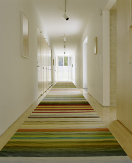
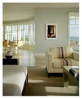
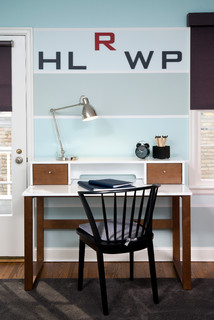
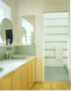
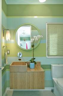
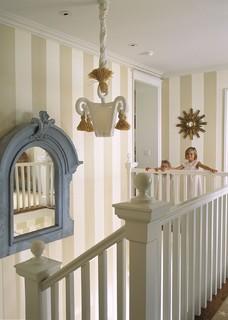
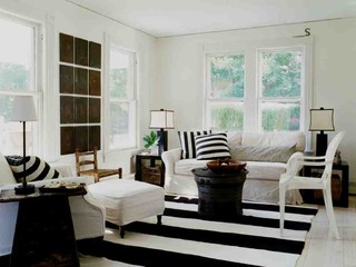
If you're afraid of pattern but want to add visual interest to a room, stripes are the way to go. You can have them on a rug, on an armchair or even on the wall. The colour combinations can be subtle or bold, depending on how much attention you want to draw to the piece.

Here are five considerations that will help you get stripes right: 

1) A narrow stripe can feel jarring and slightly busy, so think twice before introducing it on a big piece of furniture. Very thin lines like a ticking pattern, though, work well on a big piece, because at a distance the lines are blurred and look like a solid colour.

2) Wide, horizontal stripes read "contemporary". Thinner, vertical stripes are more traditional.

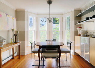
3) If you like the idea of a striped wall, consider using just one colour, and paint alternate stripes in matte and glossy finishes. The result is subtle and elegant. Wide bands look best.

4) Stripes' best playmates are solids and florals, not other stripes.

5) Stripes have an amazing directional power; they can make a ceiling look higher, a narrow hallway seem wider, and they can draw attention to a destination.

Are you ready to show off your stripes? 
Contemporary Living Room by New York
Interior Designers & Decorators Pierce Allen.
Photo: Houzz.
Interior Designers & Decorators INVIEW
Interior Design. Photo: Houzz.
 

Decorators Maria Killam. Photo: Houzz.
 

Sunday, 20 October 2013

Let the sunshine in!

 
Have you noticed how popular yellow is a as an accent colour this fall?

During a trip to Toronto last weekend, the design stores were full of bright yellow throws, pillows, rugs and the odd chair and side table. The happy, warm colour peeked at me wherever I turned my eyes, making me forget about the rain outside.

Back in North Bay, I saw the same thing at the Great Room. 

Part of the reason for yellow's popularity is that it combines so well with grey - another favoured hue.

Are we maybe ready this year to forgo the traditional red for more non-traditional yellow accents for Christmas? What do you think?

Ah, and if you're looking for something to do this Wednesday evening, why not visit the fundraising event at the Home Furniture store on Highway 17 in North Bay? There will be special sales offers, door prizes, give-aways, and more, including myself, who will be there to answer your design questions. The money raised will go to the CIBC's Run for the Cure campaign. Hope to see you there between 7 and 9 p.m.!
Yellow, the new holiday colour at Crate and Barrel.
The Sonny bench from Crate and Barrel, made from
bentwood in a classic, late 18th century design,
is perfect for an entryway. Elegant and timeless.


Yellow and blue flat weave rugs from Zara Home -
a new store in the Yorkdale Shopping Centre. Well
worth the visit.
 
 
And here are some yellow accents from the Great Room
in North Bay, plus other stylish pieces available in the
store right now:


Friday, 11 October 2013

Can you afford a designer?

Designers taking in new product offerings and
meeting colleagues at the annual IDS show in
Toronto.
OK, let's look at this. Here's the thought process of many people: "Why hire a designer? We can do it ourselves. We've seen it on TV, it's not hard. We want our style anyways. For the money we save we can splurge on the new couch. And the kitchen backsplash."

And here's what it can sound like after the fact: "The new countertop doesn't look right." "I can't seem to go past the table without bumping into it." Or: "I loved the colour in the store, but now that the painters are done, I can't stand it!"

Hm, so much for savings...

Most designers are visual people, who can quickly "figure out" a space: what will work and what won't. But he or she will only do this successfully if they have carefully listened to you first, and understand your likes and needs.

Here's some good news if you want to give a designer a try:

To celebrate my new website, during October and November my special rate for a one-hour, on-site consultation is $25. For that price, everybody can afford a designer. Click here to book your appointment.

Have a wonderful Thanksgiving weekend!

Sunday, 6 October 2013

A great room is a click away


A photo says more than a thousand words, and that also applies to design.
 
If you feel that a room in your home is not working for some reason, take a picture of it! The resulting image will give you more clues about what is needed than when you are right inside the space. Why? Because you will look at the photo with more objective eyes.

The reverse is also true of course. Tons can be learned about design simply by studying great spaces.

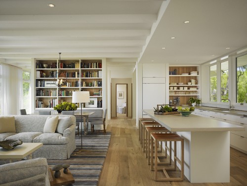
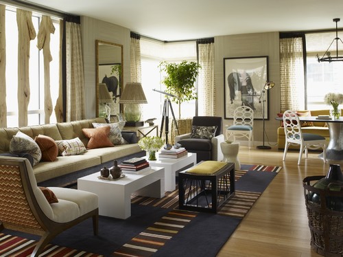
Here are two of my favourite interiors from the on-line design inspiration Houzz. I can look at them over and over, taking in all the smart design choices that make them stand out.

Read on for more on what makes these rooms sing!


This open concept space has good architectural bones, with big
windows, varying ceiling heights, and pleasing interior views.
Materials and colours are repeated throughout, pulling the space
together and making it cohesive. The furniture is arranged in such a
way that it defines different activities, while the oversized rug acts
as a unifying element. It looks so obvious and and natural, but it
didn't happen by chance! Photo: Houzz. Modern Living Room by
Winnetka Architects & Designers Robbins Architecture.
There is lots to look at in this eclectic living room by Thom Filicia! There is a nice mix of curved shapes - the ovals in the dining chairs, the soft arch of the closest armchair - and more rigid lines, such as the square tables and stripes in the rug. The colour combination is interesting, with the complementary colours blue and orange breaking up the neutral backdrop. The room has some nice, organic touches - in the lamp shade, basket, and window treatment - which offset the stark, black picture frame, curtain border and stool. The room is a lesson in theme and variation, and reads as relaxed and stylish at the same time. Who wouldn't want to spend time here? Photo:  Houzz. Thom Filicia Inc.