Wednesday 21 May 2014

Five favourite design tricks

Photo: 1stdibs.
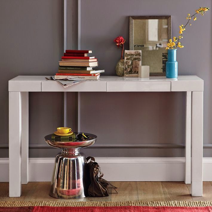
Console table from West Elm.
It's not just about "a pretty face". Good design in my book is also smart, slick and solves real problems. Plus: it's affordable.

Many times you can achieve a lot with little means. Here are some examples:

1) Problem: Space feels cramped and needs something on the walls.

Solution: Add oversized artwork with lots of depth like in the adjacent photo.


2) Problem: The room has several smaller pieces of furniture that are only needed occasionally - such as accent tables, stools and poufs. Although practical for accommodating larger groups, they take up floor space and make the room look cluttered.

Solution: Store these pieces under a console table when not in use. If you have a built-in unit made for you, consider including "niches" where these pieces can be tucked away.  


3) Problem: You prefer a calm, neutral colour palette, but still want your home to feel fun and alive. 

Solution: Inject pattern and colour selectively. The back of a bookcase and cabinet interiors are two good places. Inside a wardrobe is another.

Photo: Parents.
Photo: Houzz.

4) Problem: Space is tight, but a small office is needed.

Solution: Look for ways to optimize your home. Is there empty space below a staircase that could work? Can you make a bay window do double duty?

Photo: Remodelista.


Photo: Remodelista.

5) Problem: Tight budget and empty walls.

Solution: Use wallpaper remnants or fabric for an inexpensive art gallery.


Photo: Dwell.
 
Do you have any design tricks that you want to share? To see more of my favourites, visit my Pinterest boards.

Sunday 11 May 2014

New start for Bracebridge bungalow

The living room used to be very plain without anything special going
for it. We created a nine foot wide focal point which we clad in a
gorgeous travertine stone, and which now houses the fireplace and
the TV. By removing walls, we connected the living room with the kitchen.
 
 
The Bracebridge home that I’ve worked on for the last few months is almost done, and the result looks great! 

From having been a very ordinary bungalow from the late 1990s, it's now an inviting, comfortable and modern home for a small family.

Walls were removed, broadloom was torn up, and wooden floors were installed throughout the house.

This is the view from the front entrance before:

Before: A maze of walls.


And this is what it looks like now:
With two walls gone, the light-filled kitchen and dining area
are now integrated with the living room.


The kitchen before:


Here's a rendition of the new kitchen. We kept the sink, fridge and stove in the same locations, and left the centre free of upper cabinets. That way, we created a nine foot wide wall surface, where a beautiful marble backsplash has the undivided attention. The orientation of the island makes it possible to enjoy both the view outside and to take part in the activities in the rest of the room.


This is what the tile looks like installed.
The backsplash is a 1" hexagon
oriental white honed tile, which
relates nicely with the colours
and style of the tile of the living
room fireplace, on the opposite
side of the room.


Here are a few more shots from the home:


The former dining room was turned into a boy's computer
and TV room.


Details from one of the
bedrooms.


View of the en-suite bathroom, seen from the
master bedroom.


En-suite bathroom before.
We mixed several sizes of the same
tile on the floors and the walls, and
installed a different tile, with a striped
effect, on the shower end wall, to add
depth and interest.
Just like in the kitchen, the tile work is the shining
star. And yes, those mirrors have yet to be installed.


I hope you enjoyed the tour and the transformation of this home. It's now working for the homeowners, in every sense of the word. Happy Mother's Day!