Thursday 21 February 2013

Pantone's Emerald is a gem!

A few weeks ago we talked about Lemon Sorbet being the colour of the year for 2013... But the story doesn't end there. Of course, every colour-related company with authority wants to launch its own selection. For Pantone, the world-wide provider of colour systems and standards, the choice was a beautiful green: Emerald. It is described as "a color of elegance and beauty that enhances our sense of well-being, balance and harmony".


In colour theory, green is known to be the most universally accepted colour. Being "Nature's neutral", it's a colour that goes with everything, and it's an easy colour to live with.

There has been a tendency towards bluish-greens and yellow-greens in interior design during the last few years. Emerald is an example of the former. As you can see below, it combines especially well with other greens and blues, as well as with neutrals.

What shade of green is your favourite?


Thursday 14 February 2013

Red rooms for Valentine's


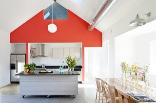
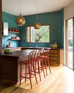
Red works wonderfully as an accent wall, as seen
in this crisp kitchen by Zero Energy Design.
Turn up the colour thermometer at home with eye-popping red! Dramatic and strong, red calls for attention and infuses a space with life and energy. But don't go overboard! Painting all the walls in a room this colour is often overwhelming. An accent wall and a few well-selected accessories are often enough to make a statement. Let these red interiors from Houzz be your inspiration for a lovely Valentine's Day!
 
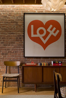
Graphic artwork in red. Simple and effective.
Photo by Elliott Kaufman.
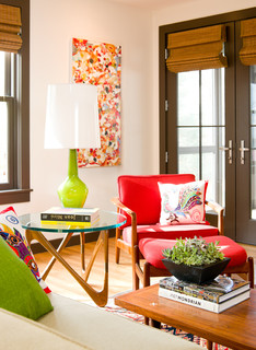
Red combined with its complementary colour
green creates a vibrant and happy corner in
this home.  Modern Living Room design by
Design.
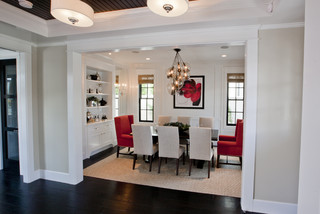
The neutral backdrop in this dining room makes the
red chair and artwork stand out. The red warms up
the space and gives it a touch of drama. Traditional
Dining Room design by Orange County Design-build
 

Try red on your porch door! Contemporary Porch design
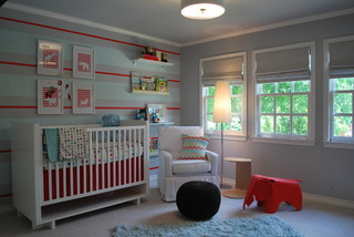
Red is an invigorating colour and best used sparingly
in a child's bedroom, where you want the little one to
sleep. For a playroom, though, it's another situation.
Red together with light blue or turquoise makes for
a charming combination. Contemporary Kids design


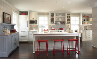
The attraction of this kitchen is in the red stools
and red accessories. Design by TreHus Architects
and Interior Designers.


More red chairs around a kitchen island.
How do you like them with the rich green
walls? By Camilla Molders Design.
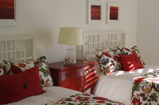
A romantic guestroom with a healthy dose of red.
Interior Designer Z3 DiseƱo.
 

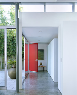
An eye-popping colour such as red indicates
"this is the front door", and helps guests find
their way to your home. Modern entry
design by Los Angeles Architect Paul Davis
Architects PC.

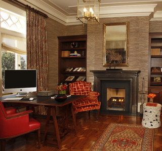
Red is an enveloping, warm colour and can work
well on the walls in a reading room/library, a cozy
TV room or any other room that you want to keep
dark. Traditional Home Office design by San Francisco
Architect Gast Architects.

Friday 8 February 2013

Cord management with a spin

"You've got to accentuate the positive. Eliminate the negative." Do the words sound familiar? The lyrics from the song with the same name are also great guidelines when it comes to interior design.

If something is beautiful in our spaces, we want to enhance it (with lighting, colours, mirrors, frames).

If something is not so pretty, we will try to eliminate it, or at least camouflage the unsightly feature. 

Electrical cords definitely belong to the latter category, and it's hard to get away from the messy tangles they create. But with these clever cable organizers it's getting easier. Click the link for each item for more info.


seldom-used devices at check behind the
work desk. Out of sight, out of mind.