Monday 28 April 2014

Three stores - three best picks

Farmhouse-style clocks in fun colours at Leon's.
What to do with an hour to kill in the northwest end of town? Check out the design offer in this part of the city of course!

Target, Leon's and Canadian Tire are all at a convenient distance from each other in North Bay. Here are my three best picks from these stores. Let me know if I missed anything!


Poufs in a variety of graphic patterns at Target.
Great for casual summer living.


Target has a very attractive blue and golden theme going
in the store...
...like this gilded lamp base that
very easily transforms into....


...this preppy lamp.

One of many accent tables from Target,
all below $100. Oops, I guess that was best
pick # 5 from Target.

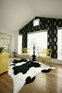
Cute armchair from Leon's. It could work equally well
in a "shabby chic" as a more traditional space.
Funky dresser from Leon's.

High, cone-shaped pots look great around
the front door. From Canadian Tire.
Stream-lined, purple couch from Leon's that becomes a bed with a simple  "klik-klak".


Canadian Tire is not known for being a "design mecca"
but the store has a good selection of nice ceiling fixtures,
like this striped glass pendant, with alternating frosted and
clear glass.
We're all itching to put some flower pots outside, so who can
resist these colourful pots and petunias from Canadian Tire?

Thursday 17 April 2014

Spring fling in yellow

Friendly, happy and casual...It's hard not to be charmed by the sunny disposition of the colour yellow. I certainly couldn't resist the cheery tulips that greeted me in the grocery store recently. I knew I had to bring some home, so that, no matter what the weather does this Easter weekend, at least it will be spring inside.

See how yellow takes on a stellar role in these warm interiors from Houzz, below.

Happy Easter!


Bath Designers Renewal Design-Build.
Architects & Designers Moore Architects, PC
Designers & Decorators Carolina V. Gentry, RID.

Sunday 13 April 2014

Hello art, goodbye blank walls

Here's what makes this display at Chapters in Sudbury look dynamic
and interesting: There's a nice mix of frame sizes, horizontal/vertical
orientation and scale of the motifs. There is also repetition of colour;
black & white, golden yellow and blue. The letters break up the sharp
edges and enhance the irregularity of the display, which means that
more pieces can be added later on. If you want a more structured grid
pattern, this works best when the pieces are all of the same size, and
follow a single motif. 


Have any blank walls at home that are begging for some action? It's easier than you think to make them come alive.

Rather than focusing on finding that one "perfect" painting with which to cover the space, take some of the pressure off and make a gallery of several smaller pieces of art instead.

Getting the composition right takes a bit of practice. But if you apply a few design principles, described in the photo caption, you'll be on your way. Lay out the pieces on the floor first, to see how to combine them, or create paper mock-ups that you tape to the walls in different combinations before taking out the hammer and nails. 


Or, if you want to make it even easier for yourself - and why wouldn't you? - buy any of the following curated collections of frameable, original prints, available for the traditional, eclectic and contemporary home. Ready to tear out and be placed in frames, they are an inexpensive way to cheer up your walls.


Here are some other artful displays that I've pinned onto my Pinterest boards:


Here, the chair is part of the mix. This display
is confined width-wise, but is allowed to really
stretch out towards the ceiling, which is enhanced
by the fact that all the pieces have a vertical
orientation. Photo: Dwell.


A composition of "empty" frames can also make for an
artful display. In this composition, two of the frames are
actually mirrors, reflecting light back into the room. I also
like the two, smaller frames inside larger ones. Photo: Houzz.

Another gallery striving upwards. The
high placement of the pieces accentuates
the high ceiling and creates a bit of tension
in this hallway - unconventional and bold.
Photo: Houzz.
Botanical prints, neatly displayed in identical frames.
Photo: Houzz.
 

Sunday 6 April 2014

Got the spring blues yet?


Savine wallpaper from Designers Guild.
Beat the latest - and hopefully last - spell of winter weather with some spring blues!

Pantone, the provider of colour systems, has announced "Dazzling blue" their colour of spring 2014. It's a bright blue that shimmers, and a colour that has been popular on the runways for some time.


Photo: Eclectic Society/Style.


Different shades of blue are certainly hot this spring. In contemporary settings we often see them mixed with black. We're also seeing more and more blue kitchens, which might seem surprising, given that the colour is associated with reduced appetite according to feng shui. Together with it's favourite team mate white, a blue kitchen certainly looks fresh and classy this season.

Photo: Houzz. Blue kitchen by Von Fitz Design.
In search of blue fabric inspiration in town, I saw some great, blue cotton and linen prints at Stewart's Decorating Centre recently. They were from Avant Garde, a brand new supplier to the store. Any of the fabrics below would make for very attractive accent pillows. At Fabricland, I also saw an interesting print, that reminded me of some of Finnish design house Marimekko's fabrics. Take a look:


Fabricland print.
Marimekko Tuuli print.
Marimekko birch tree print.


Speaking of blues, this gorgeously reupholstered chair
is looking for a new home. It is quite petite and would be a 
perfect statement chair - fun and fresh - in a nursery or a 
kid's room. You can paint the legs white if you don't like the wood.
Contact Bonell's Upholstery for more info.