Showing posts with label colours. Show all posts

Monday, 22 June 2015

Happy summer colour combos

Mother Nature has an amazing way of "getting things right". Just look at all the fantastic colour combinations that surround us this time of the year; what a great palette to draw inspiration from!

Check out these tried and true colour combos and how they look in some interiors:

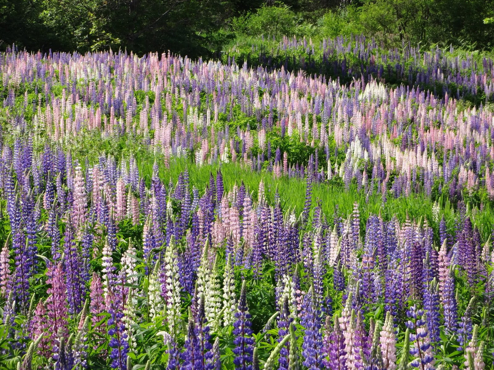
A field of purple, pink and blue lupins, with some
white thrown in here and there to calm down the
intense colours. 
Interior by Jamie Drake.


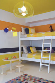
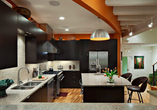
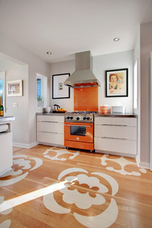
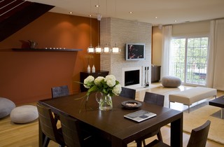
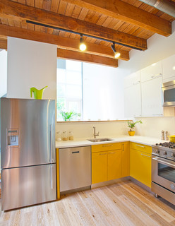
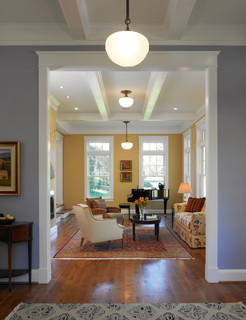
The ultimate happy summer combo: orange and yellow.
I fell in love with this colour mix when I saw it applied
to two rugs in an old home filled with character and
white-painted floors. One small rag rug was yellow, the
other, of the same size, was orange. Such an effective
and cheery colour statement!

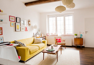
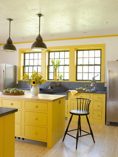
Interior by Amy Lau Design.
Here, the yellow and orange are
combined with navy blue.
Photo: Houzz.


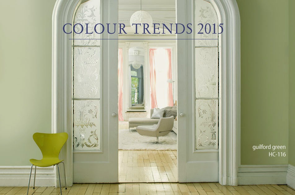
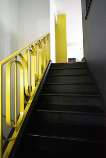
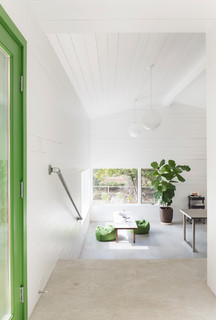
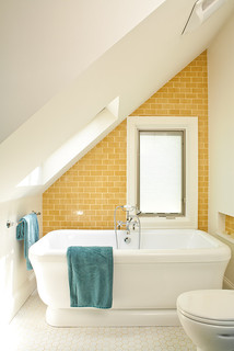
For those of us who love all things simple and crisp,
nothing beats yellow and white!

 
Interior by Jan Skacelik. Photo: Houzz.

Thursday, 22 January 2015

Colour beats the winter blues

If you, like me, spend most of your visit at the Royal Ontario
Museum at their aquarium, awestruck by the vibrancy inside,
you know for sure that you're suffering from colour deprivation!
Some call it cabin fever, I call it colour deprivation!

As winter is holding us in a firm grip, let's lift our spirits by springing into colour, and let's do it pronto, no better time than now.

While we're at it, let's also have some fun! That means going beyond the typical addition of accent pillow, colourful throw or bouquet of tulips. I'm talking real projects here with a colourful impact. After all, when we're over it, we can always paint over it.

Here we go:
Paint trim, baseboards and mouldings a cheery yellow!
Photo: Remodelista.
If youre walls have wainscoting, try a vibrant green that goes
so well with this black-and-white scheme. Photo: Benjamin
Moore.
I am craving colour in my windows now! In this
photo the purple/mauve curtains provide nice
contrast to the yellow-green chairs and pillows.
This is such a fun idea, which can be done fairly quickly,
with a lovely, humorous result. Photo: Better Homes and
Here's a variation of the same idea.
Photo: Petitepassport. 
 
Let me know if you have other colourful ideas to beat the winter blues. I'm off to get more inspiring ideas at the Interior Design Show in Toronto. Watch out for my trend report!

Friday, 31 October 2014

Going green in 2015

A vibrant, citrus-coloured chair "shakes up" this elegantly contained room,
featuring Guilford Green walls. Photo: Benjamin Moore.


The future is green, at least if you're to believe Benjamin Moore's colour experts. And despite the white fluff that has fallen from the sky today

The paint company recently announced Guilford Green from its "Historic Collection" as the colour of the year for 2015. 

Described as a "neutral that's natural", the silvery green is part of Benjamin Moore's trend palette for next year.

Below are a few interiors featuring the colour. What do you think, is it for you? (All photos: Benjamin Moore).


Thursday, 2 October 2014

Turn up the heat with orange


The trees are on fire! I hope you had a chance to enjoy them, along with the summery temperatures last weekend. What a colour explosion!

And just as the intense fall palette injects energy and life outdoors, it has the same effect if we bring it inside. 

Of the typical fall hues, orange continues to be a popular accent colour for our homes. I previously wrote about that here. It's easy to understand why it's a favourite; orange feels fresh and cheery, and partners so well with greys and other neutrals. I used it recently to give some sparkle to a basement bar that I designed (below).

Below are some other interiors where orange plays a lead role. In some cases, the use of the colour is pretty non-binding, meaning that it can be easily changed. In other cases, the homeowners are in for a longer romance with orange.

Let's have a look:

Even though orange is used sparingly around the
perimeter of this kitchen, it very effectively gives
the space a spicy and dramatic boost. Extra bonus:
it's just paint on the walls, so the look can be changed
pretty easily. Photo: Houzz. Durham Architects & Building
Designers Ellen Cassilly Architect.

An orange exclamation mark in a white
kitchen! Here the homeowners are in for
a longer romance with the bright colour,
unless they plan to change their stove
soon, of course. Photo: Houzz. Edmonds
Interior Designers & Decorators Zinc
Art + Interiors.


Orange upholstery seems like a big commitment.
An orange slipcover not so much. Photo: Houzz.
Rizzoli New York.


This orange stove is not for the faint-hearted. It's definitely a commitment. See how well it plays with its complementary colour blue. Photo: Houzz. maison21.


A rusty-orange accent wall makes this open
concept space cozy and inviting. Photo: Houzz.
FORMA Design.
The easiest way to introduce orange: through
flowers and accessories. Photo: Houzz. maison21.

Friday, 8 August 2014

Colour the way to your home


Photo: Houzz. Midcentury Exterior by Encinitas
Interior Designers & Decorators Erik Gilmer
"People keep using the back door, but I want them to come in through the front entrance."

No matter how many times my client told her friends, the small door off the deck of her Trout Lake home had become the primary entry. A peek outside revealed why; the back door had an easier access on this perched property, and nothing outside made one entry stand out over the other.

How could we change the traffic path to this home without making costly adjustments to stairs and landscaping?

With paint, of course!

Decorators bright designlab..
The first suggestion I gave my client was to paint the front door an eye-catching colour. Given the home's contemporary, playful vibe, I thought a happy yellow or orange would look great. My client was on board for yellow. So far so good.

But a happy door doesn't do the trick on its own. It needs a context. So I recommended placing oversized flower pots at the top of the steep stairs leading down to the cheery front door. The colour of the flowers? Yellow, of course!

I also suggested a coat of yellow paint on the stair railings, and yellow flowers at the foot of the stairs.
Photo: Houzz. Contemporary Entry by

See how we've started a theme here?

Sunflowers, with their majestic and contemporary look would be a great choice for the foot of the stairs! I envision them in an oversized, rectangular box casually leaning towards the sundrenched wall of the stair landing.


Finally, to complete the traffic path, I suggested placing yellow flowers also by the front door, a few feet away.

With a clear colour code established, there should be little mistake in the future which door guests should use.

As always, a little paint goes a long way!
 

Tuesday, 1 July 2014

Red and white on Lake Muskoka

Happy Canada Day! A recent summer cruise onboard the R.M.S. Segwun, docked in Gravenhurst, made me see white and red, and broadened my horizons in more than one way.
 
As we steamed our way between rocky, pine-clad shores, it was the boathouse scene, more than the oversized lakefront mansions that caught my attention.
 
Compact, comfy and with prime locations, boathouses truly encapsulate the very best of summer living. 
 
Here are a few shots from my excursion. I can highly recommend it!


Thursday, 17 April 2014

Spring fling in yellow

Friendly, happy and casual...It's hard not to be charmed by the sunny disposition of the colour yellow. I certainly couldn't resist the cheery tulips that greeted me in the grocery store recently. I knew I had to bring some home, so that, no matter what the weather does this Easter weekend, at least it will be spring inside.

See how yellow takes on a stellar role in these warm interiors from Houzz, below.

Happy Easter!


Bath Designers Renewal Design-Build.
Architects & Designers Moore Architects, PC
Designers & Decorators Carolina V. Gentry, RID.

Sunday, 6 April 2014

Got the spring blues yet?


Savine wallpaper from Designers Guild.
Beat the latest - and hopefully last - spell of winter weather with some spring blues!

Pantone, the provider of colour systems, has announced "Dazzling blue" their colour of spring 2014. It's a bright blue that shimmers, and a colour that has been popular on the runways for some time.


Photo: Eclectic Society/Style.


Different shades of blue are certainly hot this spring. In contemporary settings we often see them mixed with black. We're also seeing more and more blue kitchens, which might seem surprising, given that the colour is associated with reduced appetite according to feng shui. Together with it's favourite team mate white, a blue kitchen certainly looks fresh and classy this season.

Photo: Houzz. Blue kitchen by Von Fitz Design.
In search of blue fabric inspiration in town, I saw some great, blue cotton and linen prints at Stewart's Decorating Centre recently. They were from Avant Garde, a brand new supplier to the store. Any of the fabrics below would make for very attractive accent pillows. At Fabricland, I also saw an interesting print, that reminded me of some of Finnish design house Marimekko's fabrics. Take a look:


Fabricland print.
Marimekko Tuuli print.
Marimekko birch tree print.


Speaking of blues, this gorgeously reupholstered chair
is looking for a new home. It is quite petite and would be a 
perfect statement chair - fun and fresh - in a nursery or a 
kid's room. You can paint the legs white if you don't like the wood.
Contact Bonell's Upholstery for more info.