 |
And just as the intense fall palette injects energy and life outdoors, it has the same effect if we bring it inside.
Of the typical fall hues, orange continues to be a popular accent colour for our homes. I previously wrote about that here. It's easy to understand why it's a favourite; orange feels fresh and cheery, and partners so well with greys and other neutrals. I used it recently to give some sparkle to a basement bar that I designed (below).

Below are some other interiors where orange plays a lead role. In some cases, the use of the colour is pretty non-binding, meaning that it can be easily changed. In other cases, the homeowners are in for a longer romance with orange.
Let's have a look:
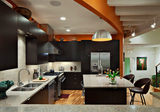 |
Even though orange is used sparingly around the
perimeter of this kitchen, it very effectively gives the space a spicy and dramatic boost. Extra bonus: it's just paint on the walls, so the look can be changed pretty easily. Photo: Houzz. Durham Architects & Building Designers Ellen Cassilly Architect. |
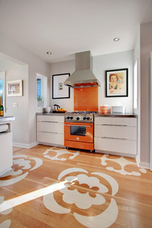 |
An orange exclamation mark in a white
kitchen! Here the homeowners are in for a longer romance with the bright colour, unless they plan to change their stove soon, of course. Photo: Houzz. Edmonds
Art + Interiors.
|
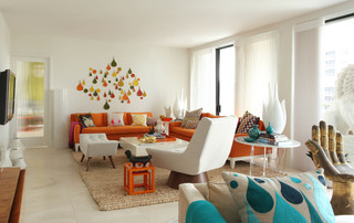 |
Orange upholstery seems like a big commitment.
An orange slipcover not so much. Photo: Houzz. Rizzoli New York. |
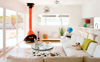 |
This orange stove is not for the faint-hearted. It's definitely a commitment. See how well it plays with its complementary colour blue. Photo: Houzz. maison21.
|
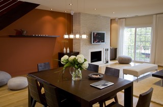 |
A rusty-orange accent wall makes this open
concept space cozy and inviting. Photo: Houzz. FORMA Design. |
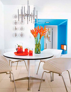 |
The easiest way to introduce orange: through
flowers and accessories. Photo: Houzz. maison21.
|

No comments:
Post a Comment
Note: only a member of this blog may post a comment.