Monday, 28 April 2014

Three stores - three best picks

Farmhouse-style clocks in fun colours at Leon's.
What to do with an hour to kill in the northwest end of town? Check out the design offer in this part of the city of course!

Target, Leon's and Canadian Tire are all at a convenient distance from each other in North Bay. Here are my three best picks from these stores. Let me know if I missed anything!


Poufs in a variety of graphic patterns at Target.
Great for casual summer living.


Target has a very attractive blue and golden theme going
in the store...
...like this gilded lamp base that
very easily transforms into....


...this preppy lamp.

One of many accent tables from Target,
all below $100. Oops, I guess that was best
pick # 5 from Target.

Cute armchair from Leon's. It could work equally well
in a "shabby chic" as a more traditional space.
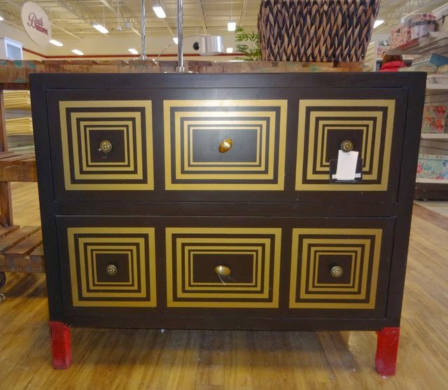
Funky dresser from Leon's.

High, cone-shaped pots look great around
the front door. From Canadian Tire.
Stream-lined, purple couch from Leon's that becomes a bed with a simple  "klik-klak".


Canadian Tire is not known for being a "design mecca"
but the store has a good selection of nice ceiling fixtures,
like this striped glass pendant, with alternating frosted and
clear glass.
We're all itching to put some flower pots outside, so who can
resist these colourful pots and petunias from Canadian Tire?

Thursday, 17 April 2014

Spring fling in yellow

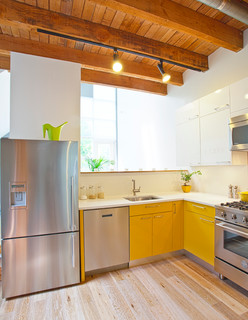
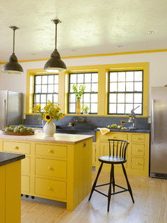
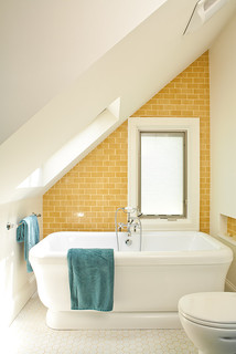
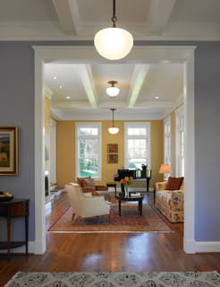
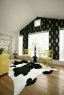
Friendly, happy and casual...It's hard not to be charmed by the sunny disposition of the colour yellow. I certainly couldn't resist the cheery tulips that greeted me in the grocery store recently. I knew I had to bring some home, so that, no matter what the weather does this Easter weekend, at least it will be spring inside.

See how yellow takes on a stellar role in these warm interiors from Houzz, below.

Happy Easter!


Bath Designers Renewal Design-Build.
Architects & Designers Moore Architects, PC
Designers & Decorators Carolina V. Gentry, RID.

Sunday, 13 April 2014

Hello art, goodbye blank walls

Here's what makes this display at Chapters in Sudbury look dynamic
and interesting: There's a nice mix of frame sizes, horizontal/vertical
orientation and scale of the motifs. There is also repetition of colour;
black & white, golden yellow and blue. The letters break up the sharp
edges and enhance the irregularity of the display, which means that
more pieces can be added later on. If you want a more structured grid
pattern, this works best when the pieces are all of the same size, and
follow a single motif. 


Have any blank walls at home that are begging for some action? It's easier than you think to make them come alive.

Rather than focusing on finding that one "perfect" painting with which to cover the space, take some of the pressure off and make a gallery of several smaller pieces of art instead.

Getting the composition right takes a bit of practice. But if you apply a few design principles, described in the photo caption, you'll be on your way. Lay out the pieces on the floor first, to see how to combine them, or create paper mock-ups that you tape to the walls in different combinations before taking out the hammer and nails. 


Or, if you want to make it even easier for yourself - and why wouldn't you? - buy any of the following curated collections of frameable, original prints, available for the traditional, eclectic and contemporary home. Ready to tear out and be placed in frames, they are an inexpensive way to cheer up your walls.


Here are some other artful displays that I've pinned onto my Pinterest boards:


Here, the chair is part of the mix. This display
is confined width-wise, but is allowed to really
stretch out towards the ceiling, which is enhanced
by the fact that all the pieces have a vertical
orientation. Photo: Dwell.


A composition of "empty" frames can also make for an
artful display. In this composition, two of the frames are
actually mirrors, reflecting light back into the room. I also
like the two, smaller frames inside larger ones. Photo: Houzz.

Another gallery striving upwards. The
high placement of the pieces accentuates
the high ceiling and creates a bit of tension
in this hallway - unconventional and bold.
Photo: Houzz.
Botanical prints, neatly displayed in identical frames.
Photo: Houzz.
 

Sunday, 6 April 2014

Got the spring blues yet?


Savine wallpaper from Designers Guild.
Beat the latest - and hopefully last - spell of winter weather with some spring blues!

Pantone, the provider of colour systems, has announced "Dazzling blue" their colour of spring 2014. It's a bright blue that shimmers, and a colour that has been popular on the runways for some time.


Photo: Eclectic Society/Style.


Different shades of blue are certainly hot this spring. In contemporary settings we often see them mixed with black. We're also seeing more and more blue kitchens, which might seem surprising, given that the colour is associated with reduced appetite according to feng shui. Together with it's favourite team mate white, a blue kitchen certainly looks fresh and classy this season.

Photo: Houzz. Blue kitchen by Von Fitz Design.
In search of blue fabric inspiration in town, I saw some great, blue cotton and linen prints at Stewart's Decorating Centre recently. They were from Avant Garde, a brand new supplier to the store. Any of the fabrics below would make for very attractive accent pillows. At Fabricland, I also saw an interesting print, that reminded me of some of Finnish design house Marimekko's fabrics. Take a look:


Fabricland print.
Marimekko Tuuli print.
Marimekko birch tree print.


Speaking of blues, this gorgeously reupholstered chair
is looking for a new home. It is quite petite and would be a 
perfect statement chair - fun and fresh - in a nursery or a 
kid's room. You can paint the legs white if you don't like the wood.
Contact Bonell's Upholstery for more info.
 

Saturday, 29 March 2014

New location - great rooms

The Great Room store entrance on 390 First
Ave. E. in North Bay.


Who doesn't want a great room? If you're the least interested in design, the answer is probably a resounding "I certainly do"!

A good first step to achieving that objective is to check out the store with the same name in downtown North Bay. The Great Room recently moved to the lower floor of a 1909 house on 390 First Ave. E, just next to Fischer.

The 800 square-foot area is divided in various rooms, and provides an intimate setting for the store's classic and contemporary pieces. Take a look!
 
If you like white-washed pieces - which is my case - this is a great mirror.

 
Grey couch from G Romano. The tufted bench seat, narrow
arm rests and overall straight lines give it a light, tailored look,
despite its width. 
Blue - a hot colour this spring.

A versatile, wooden console.

Monday, 24 March 2014

Big box outing in Sudbury

We all need a change of scenery from time to time, so when the suggestion of a combined Costco and design trip to Sudbury came up recently, I jumped at the opportunity.

Nothing beats a little traveling when it comes to inspiration gathering. Even if it's just an outing to a neighbouring city, the simple action of "going away" seems to do wonders to both energy levels and idea bank. That's at least my experience. Sometimes, a walk in the woods has the same effect.  

My exploration of some of Sudbury's big box design stores was more of a power walk than an easy stroll, but it got my creative juices flowing. Here are some highlights:
This cool, mauve settee greeted visitors at the entrance
of HomeSenseThe tall, tufted back gives it an elegant,
stately presence. Tall pieces make the ceiling look lower,
which is often desirable when you want to create intimate,
inviting spaces. The settee made me think of.... 
...the breakfast nook in decorator Maria
Killam's kitchen, which was recently
featured in Style at Home. The exaggerated
height of the back of the bench sends a message
of importance to the world. The fact that it
blends in with the white walls makes it
less bossy and completely liveable. Two
sconces complete the look and make the need
for artwork completely redundant.


Dressers used to be plain and utilitarian,
but today we're seeing more and more playful
and individualized designs. This piece from
HomeSense looks like a knock off of ...
... West Elm's patchwork dresser.

Another dresser from HomeSense. You can achieve the same
eye-catching result with an old dresser (or a plain IKEA dresser),
some stencils and paint.
My previous blog post talked about fireplaces... Here's a realistic-looking electric Dimplex unit, carried by Sears. The light reflects against mist, creating an illusion of flames and smoke. Easy and safe!

These multi-coloured sisal rugs
at Pier1 are fun, versatile and
very affordable. I'm thrilled that
Close-up of the gorgeous coral rug. Be aware of spills, though. You don't want to place your natural fiber rug anywhere that's damp or where spills are likely to occur.


Saturday, 15 March 2014

Focus on the fire

Photo: Napoleon fireplaces
Photo: Houzz. Parkwoods Home.
What to do with a living room that is "ordinary", without anything really exciting going for it? 

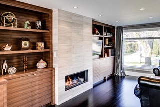
One well-tried option to get it to sparkle in every sense is to add a fireplace. With the vast selection of fireplace options out there today, it has never been easier.

And since you're putting it in, don't be afraid of enhancing its importance in the room. I'm working on a project right now, where we've installed it in a nine-foot wide surround which is clad with a gorgeous travertine tile. The photos you see served as inspiration shots.

Initially, we had planned to make the surround part of a wall-to-wall combined storage/display unit, but we later decided to make it a stand alone piece.

The TV will go above the fireplace. In  order to make the TV almost disappear, we decided to paint the centre area of the surround a very dark grey instead of tiling it.

Here are some photos of the process. Stay tuned to see the end result!

Saturday, 8 March 2014

Moving forward - clocks and projects

Photo: House Beautiful.

 
No matter what the weather does, this weekend we are taking an important first step towards spring. Yay! Daylight savings time gives us more bright hours and renewed inspiration. There really is no better time than now to start planning our next home projects. Soon the frenzy of spring will set in and we will have less time.

Let's start small to get our decorating juices flowing. Here are three easy ways to get our homes in an early spring spirit:

1) Green plants. It's amazing what a little greenery can do. Plants inject colour and a natural touch to a space. Tall and powerful, like in this photo, they are perfect for a lonely corner. 


Photo: Houzz.
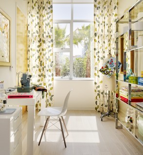
2) New curtains. You can make a room look like a million bucks with a new set of curtains. This time of year, we are yearning for happy looking windows, so don't shy away from patterns! 

3) New bed linen in fresh spring colours. Colours like acid green and bright yellow will make us fall asleep and wake up with a smile on our faces.

I know it's still winter and there's still snow on the ground, but it's time to spring forward!


Photo: Serena and Lily.