Nothing beats a little traveling when it comes to inspiration gathering. Even if it's just an outing to a neighbouring city, the simple action of "going away" seems to do wonders to both energy levels and idea bank. That's at least my experience. Sometimes, a walk in the woods has the same effect.
My exploration of some of Sudbury's big box design stores was more of a power walk than an easy stroll, but it got my creative juices flowing. Here are some highlights:
 |
This cool, mauve settee greeted visitors at the entrance
of HomeSense. The tall, tufted back gives it an elegant, stately presence. Tall pieces make the ceiling look lower, which is often desirable when you want to create intimate, inviting spaces. The settee made me think of.... |
 |
...the breakfast nook in decorator Maria
Killam's kitchen, which was recently
featured in Style at Home. The exaggerated height of the back of the bench sends a message of importance to the world. The fact that it blends in with the white walls makes it less bossy and completely liveable. Two sconces complete the look and make the need for artwork completely redundant. |
 |
Dressers used to be plain and utilitarian,
but today we're seeing more and more playful
and individualized designs. This piece from
HomeSense looks like a knock off of ...
|
 |
... West Elm's patchwork dresser.
|
 |
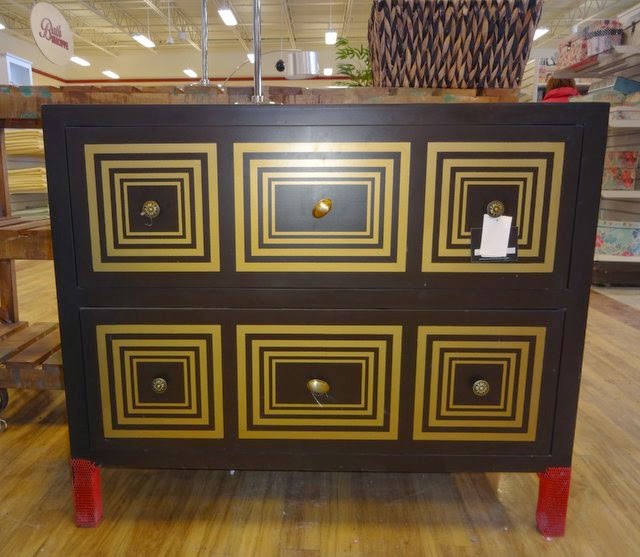
Another dresser from HomeSense. You can achieve the same
eye-catching result with an old dresser (or a plain IKEA dresser),
some stencils and paint.
|
 |
My previous blog post talked about fireplaces... Here's a realistic-looking electric Dimplex unit, carried by Sears. The light reflects against mist, creating an illusion of flames and smoke. Easy and safe!
|
 |
These multi-coloured sisal rugs
very affordable. I'm thrilled that
|
 |
Close-up of the gorgeous coral rug. Be aware of spills, though. You don't want to place your natural fiber rug anywhere that's damp or where spills are likely to occur.
|

No comments:
Post a Comment
Note: only a member of this blog may post a comment.