Sunday, 23 February 2014

Dramatic art with a sense of mystery


We are lucky to have many gifted artists in the North Bay area, and Claire Domitric is one of them.

Claire creates expressive paintings, drawings and prints, with which she aims to "evoke thought and discussion".

I recently visited her home studio to learn more about her work. Here are the highlights from our discussion:


How did your interest in art begin?
CD: I've always been drawing and doing art, and I always enjoyed school art projects. I started painting in high school and moved on to get a Fine Arts degree, and later a Bachelor of Education. For some years, I was teaching art and drama to high school students.

Underwater, acrylic on canvas, 16”x 16”.
What is it about painting and art that you're attracted to?
CD: I like the materials and I like colours. Painting is a good way to process things you see and experiences you have. I like the discovery part of the artistic process, and never know what my pieces will look like in the end. I like not knowing. I follow a narrative and let the story develop as I'm painting.

You describe your work as “representational with an expressive brushstroke”. How do you achieve that style?
My art is representational but not photographic. There's a story behind every painting, about the place and the people. The starting point is almost always a photo, or various photographs, which I transform into a painting. There is often a sense of mystery and stillness in my pieces.

“Cards”, acrylic on canvas, 12” x  16”.

How are those feelings noticeable in your art?
CD: I don't think about it so much when I paint. That's more what I see in the painting in retrospect. The sense of mystery comes from the fact that I leave some things out, I don't completely finish parts of the painting.


"Dog Day", acrylic on wood, 6” x12”
Your pieces often include water, sky and outdoor activities.
CD: Yes, I'm drawn to water and I like being outside. I also think it's good to follow a general theme and limit the colour palette - it keeps things together. People and animals are also often in my paintings.


Waterfall, monoprint on paper, 17” x 20”.
“Meet you at the Horizon”, monoprint on paper,
20” x 26”. Monoprints are made by applying oil based inks to a plexiglass plate. After a process of rolling, brushing, scraping and wiping inks on the plate, Claire puts the plate through a printing press to transfer the image onto a prepared sheet of paper. In this way, she creates one original print at a time.

The series of paintings “Summers spent” have a very impressionistic feeling. How did that collection come about?
I found photographs from my childhood summers, which my family and I often spent in northern Ontario. They were taken by parents and friends and depict a carefree, relaxed summer feeling with youth playing in nature.

"Hide and Seek", acrylic on canvas, 30” x  30”.

"The Raft", acrylic on canvas, 16” x 16”.


Claire, with Pepe, in front of "The Cutting Garden",
acrylic on canvas, 30” x 30”. Claire likes to use
big canvases.
Can people buy your paintings directly from you?
Yes, my paintings are available on my website. I'm also open to commissioned work, I like the challenge.

Claire is a member of the North Bay Art Association, and frequently participates in art exhibitions in North Bay and area. Make sure to visit her website www.clairedomitric.com.

Also check out my previous post "Looking at art from the start". Claire's colourful, contemporary paintings make for wonderful "jumping off" pieces for any room!


Friday, 14 February 2014

Love is in the details

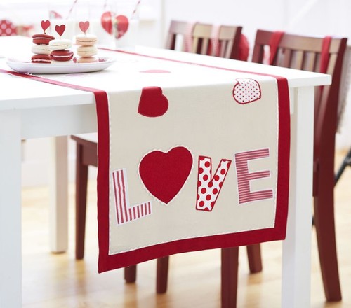
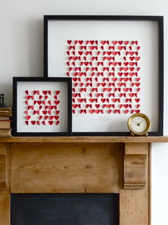
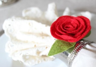
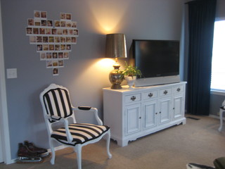
Love is in the air, and love is in the details. Check out these lovely ideas for your home.

Happy Valentine's!


Photo: Houzz. 

Art work from Serena and Lily.

Heart bowls from West Elm.

Bird cage shakers from Pottery Barn.
 
Photo: Houzz.
 
Photo: Houzz.

Photo: Houzz.
 
 
Photo: Houzz.
 

Sunday, 9 February 2014

Trend report 2014

Will quirky, bold and fluffy be design styles you adopt this year? Check out my trend report for more on what's hot, hip and history in design this year.

Saturday, 1 February 2014

Glam in a can - 10 IKEA revivals

The glamorous side of IKEA at IDS 2014.
It was all glitter and glam at IKEA's booth at the Interior Design Show last week (trend report coming soon!).

And while opulence is normally not a trademark of the budget-friendly big box store, you can fairly easily convert IKEA's pieces into high-style, shimmering showstoppers.

Check out these ten amazing transformations:


1) Vittsjö shelving unit and gold paint:

Photo source: Sköna Hem.

 2) Angenäm bowl and lamp cord and socket kit:

Photo source: Sköna Hem.

3) Vittjö nesting tables and gold paint:


4) Malm chest, stencil and gold paint:


Photo source: veracamilla.nl

5) Lerberg trestle, gold or copper paint:


 6) Koppang chest, gold or brass nails and hardware:


 7) Patrik swivel chair, brass paint:
Photo source: thanir.com

8) Ekby Järpen/Bjärnum wall shelf, gold paint:

Photo source: designmanifest.com

9) Rast chest, black paint, brass hardware:

Photo source: Källa: yourmoderncouple.com

10) Lack side table, brass nails, leather details and glass top:

Photo source: thezhush.blogspot.se

Wednesday, 22 January 2014

Kitchen backsplash: bold or bland?

This patterned backsplash at Kitchen Gallery becomes
very "livable" thanks to the otherwise monochromatic
colour scheme, and streamlined cabinetry.


Should a kitchen backsplash make a statement, or is it better to play it safe? At Kitchen Gallery in North Bay, the trend is definitely in favour of statement backsplashes. "We are seeing more pattern and boldness", says Kristin Lowe, the Kitchen Gallery's owner and designer. She credits that fact to the vast selection of materials that's available now.

The offer in Kristin's store includes lots of natural stone such as marble, travertine and slate; blends of materials like glass/marble; and backsplashes featuring metals and other reflective materials.


Whether to go bold or not on the backsplash depends largely on the style of the surrounding cabinetry and the overall colour scheme in the room, explains Kristin. "It's a way to inject pattern and texture in a monochromatic space. What makes it successful is the natural beauty of the stone."

White kitchen by Kitchen Gallery's Aimée Cazabon.
For those homeowners who still want to play it safe, a white subway tile and long, narrow, all-stone tiles are good alternatives. They are also best-sellers in Kristin's Fisher Street store.

What's your backsplash preference, bold or bland?


Saturday, 18 January 2014

Trend predictions for 2014

Brass pendants warm up this grey-and-white
kitchen, and mix well with the stainless steel
appliances.
2014 is here and it's covered in gold, at least as far as design goes. Brass and gold are definitely hot-hot-hot. They are used in faucets, lighting and accessories, and are often mixed with other metals.

At the upcoming IDS show in Toronto next week, I expect to see lots of warm, golden metals, along with... 


... abundant shades of rich and deep blues, especially navy blue, and...
Kitchen from Kelly Deck Design.


Blue-and-white dishware, like this from Crate&Barrel,
is making a comeback.


Jonathan Adler Ipanema Multi-bloom pendant.


... many interesting displays of big, sculptural light fixtures, plus...


... numerous geometric patterns.
Pillow from West Elm.


Check out my trend report after the show to see if I'm right!

At the same time, across the pond, trend watchers in Scandinavia anticipate these four design streams for the next two years:

Marble and brass are big in the "Pure classics" style.
1) “Pure classics” - an elegant and sophisticated style mixing old and new, and pastel colours with grey. Great for older homes with architectural interest, it’s a trend that highlights “modern luxury”, marble, gold, brass and crystal.

2) “Secret garden” combines “rustic retro” and "modern romantic". Second-hand finds and lots of green plants are important ingredients of this trend, that also highlights bright colours and botanical prints.

3) "Natural elements", features rustic, natural materials like stone, wood, glass and leather, and also includes washed linen, and furniture with patina.

4) The fourth style, "Aqua marine" is all about water. It favours stripes and white and grey-washed furniture. Blue, combined with white is predicted to be "next summer's strongest combination" within this trend.
Colour palette for the "Aqua marine" style.

Here at home, northern Ontarians have certainly embraced the grey trend. So many walls in the homes I visit are grey, as opposed to the taupey-browns that used to be so popular. 


Target's Beaver Collection.
In our local stores, I’m happy to see more natural fibres and materials. I’m thinking of the increased selection of wool rugs at Home Depot, and many wicker and wooden pieces in Target’s Beaver collection. 


Home Depot sells Lanart's wool rugs.
 Homeowners are asking for calm, neutral and uncluttered rooms, but are also desperately craving colour, which is introduced through accent walls and accessories. 


On its way out?
While leather is still a popular choice, more people now want less slippery, and warmer, upholstered pieces, and many are looking for a less bulky appearance.

This being said, here's my ultimate prediction, and not-so-secret wish, for 2014: it will be the year when chocolate brown leather couches finally fall from the top position in living rooms across northern Ontario. 

What do you think? Will I be right?

Thursday, 2 January 2014

Happy New Design Year!

IDS is the gathering place for design enthusiasts.

If you like design and have a home project on the go, here's a tip to get your design year off to an inspiring start: The annual Interior Design Show, or IDS for short, which takes place in Toronto on January 23 to 26. 

Marketed as "the total design experience", it's a great opportunity to see new products, learn about up-and-coming designers and run into your favourite HGTV stars. 


In preparation for the show, my next post will look at some of the styles and design concepts that seem to be getting a lot of buzz right now, in Canada, across the pond, and even here in northern Ontario. Stay tuned!


The Finnish design house Marimekko is one of the international companies that will be represented at the show.

Sunday, 22 December 2013

Practical holiday entertaining

Only a couple of days to Christmas! Some of us will host large groups during the holidays, and that puts extra demands on the logistics of our homes.

Here are five easy ways to create practical flow and stylish organization when entertaining this Christmas:

1) Place an inexpensive shelving unit at the front door, where guests can put their snowy boots. It looks so much better than a jumble of footwear around the door.

2) In the living room, replace a big coffee table with multiple smaller tables that can be easily moved.

3) Use trays to organize your kitchen counters. Glasses on one tray, different kinds of beverages on another.

4) Convert a dresser or side table in the living room into a beverage refill station. It will reduce the traffic to the kitchen.

5) Remove small area rugs and runners. They can be tripping hazards when many people are moving around in the house.

Have a wonderful Christmas! Happy entertaining, and enjoy the fact that from now on the days are getting longer!

Sunday, 15 December 2013

Fun and funky upholstered finds

I love the wave print and channel tufting
on this old-meets-new, stately chair.


It's the creativity that Bonnie Bonell loves the most about her job. With skilled hands and TLC, she gives new life to tired quality pieces, transforming them into one-of-a-kind furniture that will be used and loved for many more years to come.

Bonnie's company, Bonell's Upholstery, celebrates 40 years in business this year, and recently hosted a well-attended anniversary show and sale for the occasion.

Among the pieces for sale were funky chairs, fun ottomans and colourful pillows. Dressed in updated fabrics and with details such as piping and nailheads, they looked current and fresh - totally prepared to give personality and flair to any home. What a great idea for a Christmas!

Here are some of my favourites:


Upholstered in a rich purple velvet and with details in
a contrasting fabric, this chair looks sumptuous and
somewhat decadent. It's the perfect statement chair
for an entrance, bedroom, living room, or creative office. 


A high-gloss black gives this cane chair a modern
expression. The contrasting fabrics add interest.


The vintage needlepoint flower print is a perfect choice
for this curvy bench. Ideal for a "shabby chic" or French
country interior, it's a practical piece for a front hall or at
the foot of a bed.
Bonnie turned a vintage patchwork fabric into a groovy pillow,
with leather on the back. Love it!
A small footstool or ottoman can be that single,
special item that give a whole room a certain mood
and personality.

The fabric on this chair is hand-painted and stencilled by Bonnie.
Contrasting purple velvet on the back. Cute!