 |
Photo: House Beautiful.
|
Shape, colour and material will affect if objects in our surroundings read as "feminine" or "masculine". Anybody wanting to achieve a "gender-neutral space" - one where both men and women feel equally comfortable - should make sure that there is a good balance between feminine and masculine vibes.
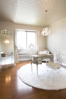
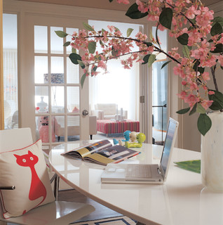
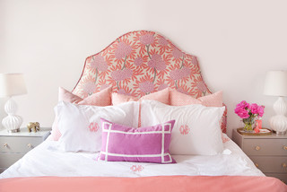
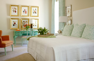
Stripes, leather, corduroy, boxy furniture, dark colours, wood and fireplaces read as "masculine". Soft textiles, rugs and furniture with curves or irregular shapes, pastels and light colours, mirrors and flower arrangements are examples of feminine features.
There are ways to "play up" or "play down" objects' "gender", but more about that in another post. For now, let's look at some typically feminine spaces, and let's congratulate all wonderful women out there on International Women's Day!
Photo from Houzz: Eclectic Home Office design
by Dc Metro Interior Designer Supon Phornirunlit
/ Naked Decor.
by Dc Metro Interior Designer Supon Phornirunlit
/ Naked Decor.
Photo from Houzz: Traditional Bedroom design
by Little Rock Interior Designer Tobi Fairley
Interior Design
by Little Rock Interior Designer Tobi Fairley
Interior Design
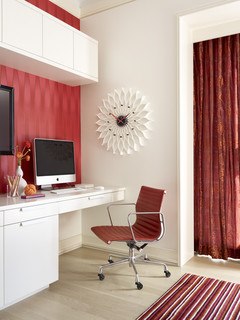 |
Photo from Houzz: Contemporary Home
|

No comments:
Post a Comment
Note: only a member of this blog may post a comment.