 |
| Breakfast nook with "new", old curtains. |
Here are three ideas that I've brought into my home this summer. None of them major or revolutionary, quite the contrary. But they all strike a chord with the style I like for my home. Rather than copying the ideas "right off", I've tried to add a personal twist to make them more "mine".
Let's have a look.
 |
Here's the inspiration shot in an interior designed by
|
1) In a previous post this summer, I talked about skipping window treatments all together, to let more light and greenery in. While I love the idea, I also like the simple and fresh look of white curtains. I wanted to try a concept using black ribbons to break up all the white. Seeing it in House & Home's special edition "Decorating with white" this summer finally convinced me to take out the sewing machine. I attached three narrow ribbons onto the existing curtains, which instantly added a graphic, contemporary punch to my breakfast nook.
 |
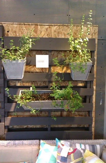
Wall display from CB2 in Toronto.
|
What I especially like about it is that the display can be changed indefinitely simply by adding, removing or changing the location of the pots.
My pots are from Target and have holes on the back and perch from nails in the slats. The pots from CB2 have a wire hanging arrangement, which allows for even more versatility. The galvanized steel also looks better than the plastic ones I used, I think, so I'll keep my eyes open for something similar.
 |
Here's my version of the display. There is still
room for more plants!
|
 |
 |
Shelf from CB2.
|
What has inspired you this summer?
 |
Here's my take on it.
|

No comments:
Post a Comment
Note: only a member of this blog may post a comment.