Monday, 22 December 2014

'Tis the season...


Oh Christmas tree, how lovely are thy branches...

A client asked me a few weeks ago what decorations to use for her tree. "Anything that makes you happy and that mean something to you", I replied, knowing the result might look nothing close to a "designer tree", but instead would be very unique and personal.

I like that approach.

I think a Christmas tree is great for letting your personality shine through and for telling your story, whether it's about travels, hobbies, traditions or culture.

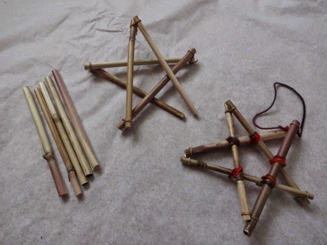
Following my own background, this Christmas I'm all over simple straw decorations, that are such a big part of the Swedish Christmas tradition.

"The real thing", bought in Sweden a few years ago.


I've made a few pieces using local materials to complement the store-bought ornaments that were already in my tree.

For a beginner straw crafter, I'm pretty happy with the result, which makes for cute little hostess gifts these holidays. Check them out below.

Wishing you Happy and Safe Holidays!
See you in 2015!


Hand-made straw star à la Nina.
Here's another shape I tried, with added
plumes in the corners.


Materials. I got the straw from the roadside along HW 17,
just west of North Bay. The waxed thread is from Lee Valley Tools
and the wool yarn from Stix and Stones in North Bay.

 
Speaking of Christmas trees, isn't this metal one just the coolest?
Made by Kathleen Atkinson-Hindle. Available at Art on Main.


Friday, 21 November 2014

Decorating: knowing when to stop

It's OK to go over board for Christmas. But instead of
decorating the whole house, try it in a few designated
areas. Photo: Livet hemma.
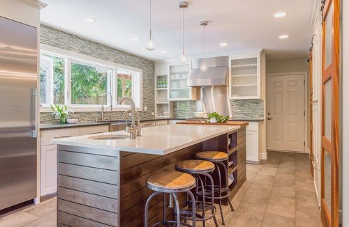
So you've found a great backsplash and now you want to apply it to all three kitchen walls.

And in the living room, you're finally happy with the many colour-coordinated pillows in the couch. (At the same time you're observing how guests perch awkwardly at the edge of the sofa instead of sinking into the sea of softness.)

If these scenarios sound familiar, you might have given in to over decorating. Don't worry, you're in good company; design magazines are filled with interiors like that!

In an effort to make our homes "perfect", it's easy to achieve something that looks overdone and that is not practical to live with. Knowing when to stop takes practice, and is also a matter of personal taste.

To get it right, I find it helpful to take the approach of a film director: a good movie features one or two stars, while the rest of the cast are supporting actors. The supporting actors give the framework and time for the stars to build their characters. Compare it to "breathing room" and space around a stellar feature in a home.

This can also be applied to Christmas decorating. I say: focus on a few rooms in your home, or even a designated corner of a room, and let the jewels glimmer without competition. Does that strike a bell? Will you try it?

In my mind, this is too much of a good thing. I'm talking about the backsplash. I would have applied it to the window wall only, making this the feature wall with the wonderful greenery outside. Photo: Houzz.

Friday, 31 October 2014

Going green in 2015

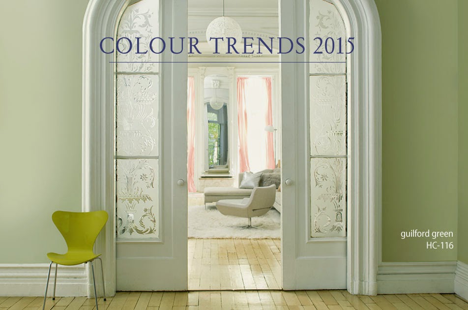
A vibrant, citrus-coloured chair "shakes up" this elegantly contained room,
featuring Guilford Green walls. Photo: Benjamin Moore.


The future is green, at least if you're to believe Benjamin Moore's colour experts. And despite the white fluff that has fallen from the sky today

The paint company recently announced Guilford Green from its "Historic Collection" as the colour of the year for 2015. 

Described as a "neutral that's natural", the silvery green is part of Benjamin Moore's trend palette for next year.

Below are a few interiors featuring the colour. What do you think, is it for you? (All photos: Benjamin Moore).


Monday, 20 October 2014

Bright ideas for a cloudy day

With an airy and geometric frame, this fixture
looks more like a sculpture than a light source.
Photo: West Elm.
The weather might be dull, but inside it's sure luminous! Lighting is enjoying a revival today as one of the key ways to set a room's style and boost its personality. 

For contemporary lighting, the trend continues to be "less is more".

Geometric shapes are in focus, making many fixtures look more like sculptures than light sources.

The pared-back industrial style is also still making strides, featuring fixtures with little more than a bulb and a wire. Simple and efficient.

Too simple, you might say?

But easy is good, especially if you're into DIY. And DIY is great if you're on a budget but still want high style. 
 
Ready to challenge your creativity? Below are links to three awesome lighting projects to try on a cloudy day. As always when it comes to electrical work, leave the final installation to a certified electrician. Here we go:
 

1) These fashion-forward fixtures are made of drinking straws, pipe cleaners, spray paint, cord and light socket. You get the idea just by looking at the pictures of the site.


2) To complete the Lindsay Adelman's Hanging Pendant above, you buy a complete kit here ($57) and follow the instructions. Lindsay Adelman's DIY projects also include a chandelier, mobile, desk lamp and sconce. Photo: Remodelista. Here are the parts for the Hanging Pendant kit:


3) Finally, here's a link to making an industrial pipe floor lamp (below).
http://howaboutorange.blogspot.ca/2014/04/how-to-make-industrial-pipe-floor-lamp.html. Make sure to read all the comments regarding enhancing the safety of this lamp.


Thursday, 2 October 2014

Turn up the heat with orange


The trees are on fire! I hope you had a chance to enjoy them, along with the summery temperatures last weekend. What a colour explosion!

And just as the intense fall palette injects energy and life outdoors, it has the same effect if we bring it inside. 

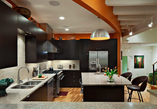
Of the typical fall hues, orange continues to be a popular accent colour for our homes. I previously wrote about that here. It's easy to understand why it's a favourite; orange feels fresh and cheery, and partners so well with greys and other neutrals. I used it recently to give some sparkle to a basement bar that I designed (below).

Below are some other interiors where orange plays a lead role. In some cases, the use of the colour is pretty non-binding, meaning that it can be easily changed. In other cases, the homeowners are in for a longer romance with orange.

Let's have a look:

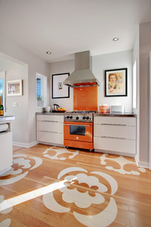
Even though orange is used sparingly around the
perimeter of this kitchen, it very effectively gives
the space a spicy and dramatic boost. Extra bonus:
it's just paint on the walls, so the look can be changed
pretty easily. Photo: Houzz. Durham Architects & Building
Designers Ellen Cassilly Architect.

An orange exclamation mark in a white
kitchen! Here the homeowners are in for
a longer romance with the bright colour,
unless they plan to change their stove
soon, of course. Photo: Houzz. Edmonds
Interior Designers & Decorators Zinc
Art + Interiors.


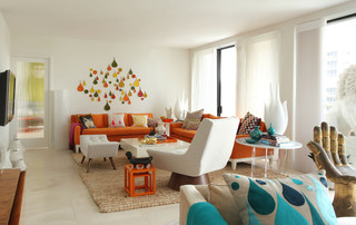
Orange upholstery seems like a big commitment.
An orange slipcover not so much. Photo: Houzz.
Rizzoli New York.


This orange stove is not for the faint-hearted. It's definitely a commitment. See how well it plays with its complementary colour blue. Photo: Houzz. maison21.


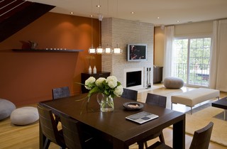
A rusty-orange accent wall makes this open
concept space cozy and inviting. Photo: Houzz.
FORMA Design.
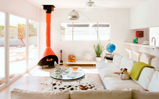
The easiest way to introduce orange: through
flowers and accessories. Photo: Houzz. maison21.

Sunday, 21 September 2014

New location a Winner


Have you heard? Winners in North Bay is now located in the new strip mall on McKeown Avenue.
 
The brand new facilities of the "find fabulous for less" store are bigger than the old location, but the overall look and feel remain the same. 
 
Clothing dominates the product offering. It has a prime position in the store, whereas the home décor section is tucked in the back. In fact, the space reserved for furniture, lamps and decorative items seems smaller than in the Lakeshore location. Somewhat disappointing I must say!

In any event, a visit to the store continues to be a "must" for anybody hunting for stylish benches or banquettes, neat storage solutions, small tables and accessories.
 
Let's take a look at some of the items in the store right now.
 
 
Industrial-style stools.

Beautiful bench with nail head trim and tufted seat.
Winners is a good place for
shabby-chic pieces, such as
this mirror with a washed-out
patina.


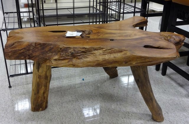
Root table à la Winners.

A laundry basket on wheels can be practical.

Friday, 12 September 2014

Design lessons from Jamaica

Hot, bright colours and cool, breezy interiors. That's the interior design slant of my recent mini-vacation in Jamaica.

The upscale Montego Bay resort where I stayed bravely mixed heavy, dark furniture with bold colour combos. It was a tropical interpretation of the Spanish colonial style, wrapped in marble, glass and shiny metals. At times exaggerated, and far from your every-day Jamaican home of course, it was interesting for a design enthusiast like myself.

Here are three design lessons that I was reminded of during my stay:

1) Scale and proportion: If you have the space you can really go for it. Big rooms require big furniture. And soaring ceilings call for heavy light fixtures and pieces that draw the eyes up. 
Breathtaking, high ceilings in the hotel lobby.
2) Round shapes: There are so many square and rectangular surfaces in a house. To avoid the sharp corners and in order to break up all the straight lines, it's good to introduce some roundness, whether it's in the yard or inside. Meandering paths, round mirrors and semi-circular tables are just a few ways to give a space some softness.

Semi-circular "swim-up" bar.

3) Hot climates, bright colours: The climate we live in definitely affects the way we decorate. In the north we tend to hold back and choose neutrals and subtle colour combinations, creating soothing interiors that reflect our surroundings. On a tropical island filled with colourful birds, fish, people and vegetation, the interiors are likely to be playful and bold against a white backdrop.


This cool  blue would be a rare colour choice for a northern Ontario restaurant,
don't you think? In Jamaica, it right at home!


The hotel bar area featured an interesting mix of textures,
materials, shapes and colours. The illuminated bar itself draws
visitors in (more than once!).
Even though the interiors were interesting, it was outside, on the beach, where I spent most of the time.

Until next time, Jamaica!