Thursday, 31 January 2013
Trend report 2013
Let's look at what's new, fun and trendy from the world of design! Click here to read my 2013 Trend Report from last week's Interior Design Show in Toronto.
Thursday, 24 January 2013
Add some radiance
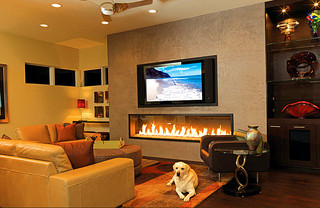
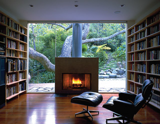
 Yikes! Canada is in a cold spell and North Bay is no exception. Let's turn up the heat a bit with photos of inspiring, warm fireplaces. At the bottom of the post you'll find two fun, red-enameled stoves that I came across during a visit to the Home Hardware store on Algonquin Avenue some weeks ago.
 Stay warm!
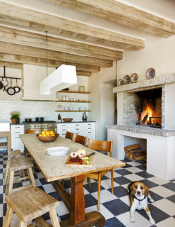 |
With kitchens being "the new living rooms",
a fireplace in this room makes complete sense.
|
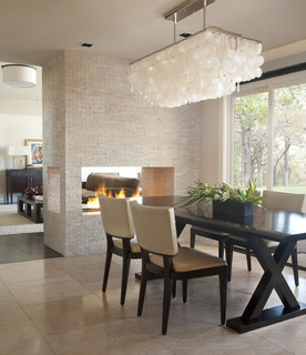 |
Who doesn't like dinner next to the fireplace?
It enhances the social atmosphere you want to
create and provides a focal point. Contemporary
Interiors. Photo from Houzz.
|
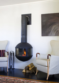 |
A contemporary, wall-mounted fireplace. Design
Photo from Houzz.
|
Red stoves from Home Hardware on Algonquin:
Friday, 18 January 2013
Turn homely into helpful
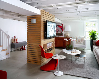 |
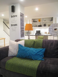
A structural post in the "wrong" location, can become a functional
and stylish feature in your space. Picture from Houzz: Modern
|
The homeowners wanted to use their basement as a TV room, but a column in the middle of the space made most furniture plans less than ideal. The solution? Using the "lost" area below the staircase to host the TV. This plan created more flexibility for TV watching and also minimized the importance of the structural post. Clever use of lighting, eye-catching wall art and inviting seating will further divert the attention from the less-than-beautiful column.
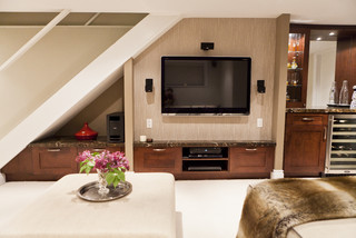 |
Let the space below a staircase "work" for you.
|
Had we had the space, we might have decided to let the column "work" for us instead of trying to camouflage it. Alternative solutions could include transforming it into a practical shelf to display treasures on, turning it into a slatted media unit, or using it to display art. Check out these pictures from Houzz for inspiration. Have you dealt with similar situations in your home? I'd be delighted to hear how you solved them!
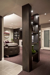 |
Create a second post, add shelves and transform
the column into a practical bookcase or display unit. Contemporary Basement design by Calgary General Contractor Urban Abode. Photo from Houzz. |
 |
Thursday, 10 January 2013
Say hello to Lemon Sorbet!
 |
Lemon sorbet is Benjamin Moore's colour of the year 2013.
Yellow is a strong directional hue this year, according to Allaire-Perrault. |
At a seminar organized by Trout Lake Paint/Stewart's Decorating last November, she presented her company's "most inspiring colours for 2013" and encouraged us to experiment. "Paint is one of the easiest and cheapest tools you have in your toolkit", commented Leigh-Ann as she shared the latest from her world of design, and I agree.
Here are ten highlights from her talk:
1) Paint can update anything. And you can paint anything.
2) There is only one rule in design: If you love it and it looks right for you, then it's right!
3) Curate your home with objects that speak to you. (More about curating in another blog post).
4) We'll see more softer, lighter pastels in 2013.
5) Match ceilings to floors and you will achieve balance and harmony in your home. Leigh-Ann calls this "the mirrored balance" (see photo below). In general, the ceiling is the perfect place to add accent colour, according to Leigh-Ann.
6) Colours define a decade. Last decade was "greige" (greyish beige hues).
7) Take inspiration when possible, but don't be a copy cat.
8) Introduce pops of colours in unexpected places, such as the front hall closet.
9) Use cut-out stencils to paint a patterned backsplash.
10) When in doubt, try a new colour in a throw cushion.
Plenty of tips in one compact and inspiring seminar! And lots of material for future blog posts - stay tuned.
Did I come home with anything else from the seminar? Yes, a door prize (including a fancy cap) and an intense urge to try out "dusty mauve" at home. After all, I can always paint over it when I'm over it.
 |
Benjamin Moore's Artisan collection includes "earthy tones and
rich, saturated colours". This is an example of the "mirrored
balance" that Leigh-Ann talked about.
|
 |
The Urbanite collection includes "chic, crisp hues and unexpected
contrasts that convey a cool, cosmopolitan vibe".
|
 |
The New Traditional hues offer "a fresh interpretation of classic
elegance, showcasing bold colours and patterns to create a warm,
inviting retreat". Here you see the "dusty mauve".
|
 |
Costal is a "refreshing, nature-inspired palette, infused with a
contemporary sensibility that transcends the unexpected". The
colour of the year, Lemon sorbet, is part of this collection.
|
Thursday, 3 January 2013
Make room for the new year
 |
Keep your clutter at bay with appropriate storage.
Organize your items by colour, it makes it more
restful for the eye. Storage cabinet from Crate and
|
1) Go room by room and define the function of each room. Think about what you need for that specific room and get rid of everything else.
2) Old magazines and books can take up an incredible amount of shelf space. Weed out what no longer interests you. Tackle the rest a little at a time. File magazine clippings in binders organized by theme.
3) Dishes in your cupboards are like clothing in your wardrobe. If you haven't used them in the last year, you probably never will. To realize that some things simply aren't for you is quite OK. That also applies to items that were given to you. Pass them along to a thrift store. They will be somebody else's treasure.
4) Have an empty corner somewhere? Use it for extra storage. Clutter control requires a good organizational system and appropriate storage.
5) Make a promise to yourself to buy fewer things, but to buy better quality. If budget is an issue, put up a picture of the piece you are craving, and look at it regularly. It will be an incentive to save up for what you really love, and to avoid impulse purchases.
Do you agree with me that less is more when it comes to design?
Subscribe to:
Comments (Atom)


