Monday, 28 October 2013

Show off your stripes!


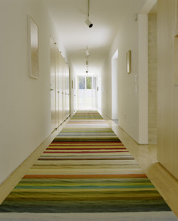
Striped rug from Pappelina.
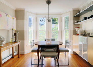
If you're afraid of pattern but want to add visual interest to a room, stripes are the way to go. You can have them on a rug, on an armchair or even on the wall. The colour combinations can be subtle or bold, depending on how much attention you want to draw to the piece.

Here are five considerations that will help you get stripes right: 

1) A narrow stripe can feel jarring and slightly busy, so think twice before introducing it on a big piece of furniture. Very thin lines like a ticking pattern, though, work well on a big piece, because at a distance the lines are blurred and look like a solid colour.

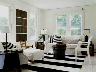
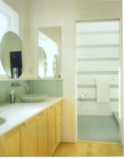
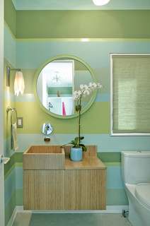
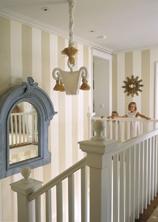
2) Wide, horizontal stripes read "contemporary". Thinner, vertical stripes are more traditional.

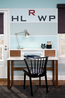
3) If you like the idea of a striped wall, consider using just one colour, and paint alternate stripes in matte and glossy finishes. The result is subtle and elegant. Wide bands look best.

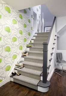
4) Stripes' best playmates are solids and florals, not other stripes.

5) Stripes have an amazing directional power; they can make a ceiling look higher, a narrow hallway seem wider, and they can draw attention to a destination.

Are you ready to show off your stripes? 
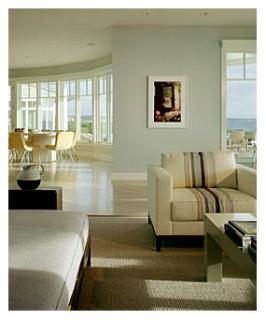
Contemporary Living Room by New York
Interior Designers & Decorators Pierce Allen.
Photo: Houzz.
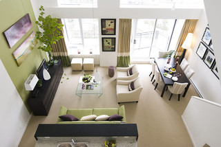
Interior Designers & Decorators INVIEW
Interior Design. Photo: Houzz.
 

Decorators Maria Killam. Photo: Houzz.
 

Sunday, 20 October 2013

Let the sunshine in!

 
Have you noticed how popular yellow is a as an accent colour this fall?

During a trip to Toronto last weekend, the design stores were full of bright yellow throws, pillows, rugs and the odd chair and side table. The happy, warm colour peeked at me wherever I turned my eyes, making me forget about the rain outside.

Back in North Bay, I saw the same thing at the Great Room. 

Part of the reason for yellow's popularity is that it combines so well with grey - another favoured hue.

Are we maybe ready this year to forgo the traditional red for more non-traditional yellow accents for Christmas? What do you think?

Ah, and if you're looking for something to do this Wednesday evening, why not visit the fundraising event at the Home Furniture store on Highway 17 in North Bay? There will be special sales offers, door prizes, give-aways, and more, including myself, who will be there to answer your design questions. The money raised will go to the CIBC's Run for the Cure campaign. Hope to see you there between 7 and 9 p.m.!
Yellow, the new holiday colour at Crate and Barrel.
The Sonny bench from Crate and Barrel, made from
bentwood in a classic, late 18th century design,
is perfect for an entryway. Elegant and timeless.


Yellow and blue flat weave rugs from Zara Home -
a new store in the Yorkdale Shopping Centre. Well
worth the visit.
 
 
And here are some yellow accents from the Great Room
in North Bay, plus other stylish pieces available in the
store right now:


Friday, 11 October 2013

Can you afford a designer?

Designers taking in new product offerings and
meeting colleagues at the annual IDS show in
Toronto.
OK, let's look at this. Here's the thought process of many people: "Why hire a designer? We can do it ourselves. We've seen it on TV, it's not hard. We want our style anyways. For the money we save we can splurge on the new couch. And the kitchen backsplash."

And here's what it can sound like after the fact: "The new countertop doesn't look right." "I can't seem to go past the table without bumping into it." Or: "I loved the colour in the store, but now that the painters are done, I can't stand it!"

Hm, so much for savings...

Most designers are visual people, who can quickly "figure out" a space: what will work and what won't. But he or she will only do this successfully if they have carefully listened to you first, and understand your likes and needs.

Here's some good news if you want to give a designer a try:

To celebrate my new website, during October and November my special rate for a one-hour, on-site consultation is $25. For that price, everybody can afford a designer. Click here to book your appointment.

Have a wonderful Thanksgiving weekend!

Sunday, 6 October 2013

A great room is a click away


A photo says more than a thousand words, and that also applies to design.
 
If you feel that a room in your home is not working for some reason, take a picture of it! The resulting image will give you more clues about what is needed than when you are right inside the space. Why? Because you will look at the photo with more objective eyes.

The reverse is also true of course. Tons can be learned about design simply by studying great spaces.

Here are two of my favourite interiors from the on-line design inspiration Houzz. I can look at them over and over, taking in all the smart design choices that make them stand out.

Read on for more on what makes these rooms sing!


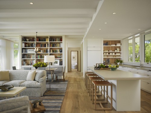
This open concept space has good architectural bones, with big
windows, varying ceiling heights, and pleasing interior views.
Materials and colours are repeated throughout, pulling the space
together and making it cohesive. The furniture is arranged in such a
way that it defines different activities, while the oversized rug acts
as a unifying element. It looks so obvious and and natural, but it
didn't happen by chance! Photo: Houzz. Modern Living Room by
Winnetka Architects & Designers Robbins Architecture.
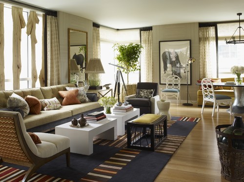
There is lots to look at in this eclectic living room by Thom Filicia! There is a nice mix of curved shapes - the ovals in the dining chairs, the soft arch of the closest armchair - and more rigid lines, such as the square tables and stripes in the rug. The colour combination is interesting, with the complementary colours blue and orange breaking up the neutral backdrop. The room has some nice, organic touches - in the lamp shade, basket, and window treatment - which offset the stark, black picture frame, curtain border and stool. The room is a lesson in theme and variation, and reads as relaxed and stylish at the same time. Who wouldn't want to spend time here? Photo:  Houzz. Thom Filicia Inc.