Saturday, 27 April 2013

Interior design and the environment

It's been "Earth Week" this week, with events around the world supporting environmental protection. What a great initiative! As consumers, we can all contribute to a cleaner environment, by the choices we make and by the way we live.

Also the interior design community is embracing the green movement, at least on paper. So many products now claim to be "green". And while some definitely are, others really aren't. If you start asking questions about the transportation, the production process and the disposal of a certain product, it gets a lot more complicated. But don't let that stop you! Asking questions is the first step of being mindful about the environment, and that's what we all need to be.

Here are other things we can do for the sake of the environment: 

1) Shop locally - it has many advantages, from minimizing transportation to keeping the money in the community. An example: locally-sourced wooden floors are so much more environmentally friendly than bamboo grown in Asia, no matter what the advertisements say!

2) Reduce, reuse, recycle, repurpose, recover... So many re-words, so many opportunities! A coat of paint, another frame on a piece of art, an old dresser that becomes a bathroom vanity... Before heading to the stores, try to think about new uses for things you already own. The most inviting homes often display a mix of old and new.

3) Go for quality rather than quantity, it will reduce your number of purchases. After all, the most environmentally friendly behaviour is to consume less.

What other tips do you have that can protect the environment?
A "truth window" shows the interior
of the wall in the straw-bail house.


The interior of an off-the-grid straw-bail house
outside Powassan that I visited some years ago.


Saturday, 20 April 2013

Learning from the pros

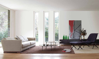
Here is an example of what it can look like when
you open up new windows between existing studs.
Modern Living Room by Philadelphia Furniture
and Accessories Usona. Photo: Houzz.
When you love houses and interior design, few things are more attractive than being invited to the home of a design professional.
That was my lucky situation a few months ago. The visit to one of my Trout Lake neighbours, a retired architect, was both educational and enlightening.

But most of all, it was a delightful experience of being in a home where careful thought had gone into every design decision. Even the surrounding trees were trimmed to display the most sculptural silhouettes!


Here are five lessons that I took home from my visit:  

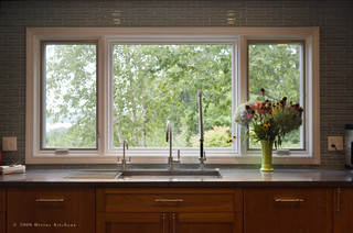
Kitchen And Bath Divine Kitchens LLC.
Photo: Houzz.


1) Let windows frame interesting views. Use them in unexpected places, like the end of a hallway, or in places where you tend to spend a lot of time, such as by the kitchen sink. For a less invasive project: create new windows between existing studs. The resulting narrow, vertical windows provide architectural interest, and bring the outside in.


Look at the outstanding corner detail
in this fascia!

2) It's all in the details! Give extra thought to how to deal with transitions between materials, corners, joints, etc. The result will make your project stand out!


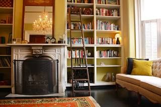
Blogs Shannon Malone. Photo: Houzz.

3) Use the ceiling height to its maximum. Take built-in bookcases and kitchen cupboards all the way to the ceiling. Put less-used items at the top.

4) Pay attention to lighting. A single, big light source in the middle of the room just doesn't cut it. A range of different lights gives more flexibility; think task lighting, ambiance lighting and general lighting. Use dimmers whenever possible.


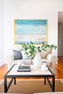
5) Go big on art. Few things can so instantly change the feeling of a room, whether you go with one big piece, or several smaller pieces grouped in a gallery. See Artful displaysA flexible approach to art and Getting the hang of art for more on art in your home. 

Ethos Interiors. Photo: Houzz.

Friday, 12 April 2013

Inspiration from the library

Interior by Nate Berkus, who designs home decor
items for Target. Can't wait to see if they will be 
in the North Bay store once it opens... 
Coffee table books on design are a great source of inspiration. My own bookshelf is full of them. I use them to get ideas, to learn from the pros and to simply indulge in beautiful interiors.

But to stay up to date with the steady flow of new books can get pricey. And sometimes you want to check out a book before buying it.

In those situations, a trip to the local library is a good idea. The North Bay Public Library does a good job at bringing in new design books.

My latest finds include Nate Berkus' "The Things That Matter" and Thom Filicia's "American Beauty". Both books were published late last year and are praised by design magazines.

Another book that I brought home, and that promises to be interesting, is: Thrift, How to have a stylish home without breaking the bank. You can never get enough of those ideas!

Now I'm keeping my eyes open for Barbara Barry's "About Beauty" and anything by Vicente Wolf. Finding them on the library shelves would be a real treat!

Do you have any great design books to recommend?


Friday, 5 April 2013

Searching for spring

Fun accent pillow will make you want to go for
a ride.
OK, the weather doesn't want to cooperate. We'll just have to pretend that it's spring outside. 

One great place to get spring inspiration is the North Bay Home and Garden Expo, which is on this weekend at the Memorial Gardens. With a two dollar admission fee, it's the best bargain in town right now!

Before you go, check out these fresh, spring-like items from Winners in North Bay to get in the right mood:


Spring is all about colour! These handy
boxes will help you stay organized in
style.


Another great storage solution. Good looking
and practical!
A new twist on one of my life mantras.
 
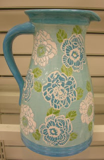
A cute jug for summer drinks.

Time to change your curtains for
something lighter and brighter!

Square glass pots in a range of happy colours.

This summer duvet would look great with..


...these lights.

Blue and white - a spring classic.

Here's that combination again, this time on a toss pillow.

Looking for a funky table lamp? Look
no further!


Here's a close up of the lights. They look really
sharp with the graphic black-and-white wallpaper
in the background.