Monday, 24 March 2014

Big box outing in Sudbury

We all need a change of scenery from time to time, so when the suggestion of a combined Costco and design trip to Sudbury came up recently, I jumped at the opportunity.

Nothing beats a little traveling when it comes to inspiration gathering. Even if it's just an outing to a neighbouring city, the simple action of "going away" seems to do wonders to both energy levels and idea bank. That's at least my experience. Sometimes, a walk in the woods has the same effect.  

My exploration of some of Sudbury's big box design stores was more of a power walk than an easy stroll, but it got my creative juices flowing. Here are some highlights:
This cool, mauve settee greeted visitors at the entrance
of HomeSenseThe tall, tufted back gives it an elegant,
stately presence. Tall pieces make the ceiling look lower,
which is often desirable when you want to create intimate,
inviting spaces. The settee made me think of.... 
...the breakfast nook in decorator Maria
Killam's kitchen, which was recently
featured in Style at Home. The exaggerated
height of the back of the bench sends a message
of importance to the world. The fact that it
blends in with the white walls makes it
less bossy and completely liveable. Two
sconces complete the look and make the need
for artwork completely redundant.


Dressers used to be plain and utilitarian,
but today we're seeing more and more playful
and individualized designs. This piece from
HomeSense looks like a knock off of ...
... West Elm's patchwork dresser.

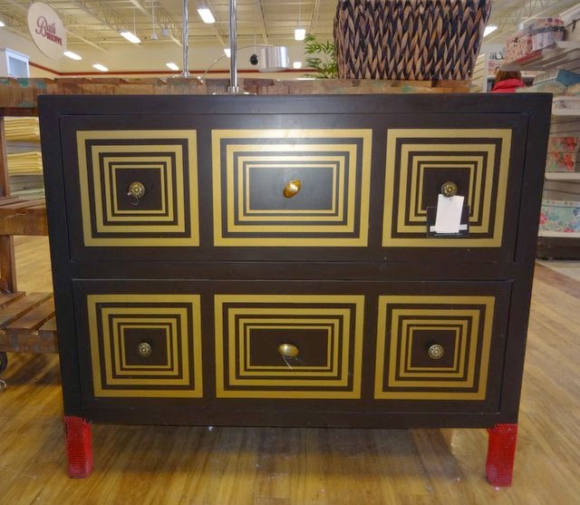
Another dresser from HomeSense. You can achieve the same
eye-catching result with an old dresser (or a plain IKEA dresser),
some stencils and paint.
My previous blog post talked about fireplaces... Here's a realistic-looking electric Dimplex unit, carried by Sears. The light reflects against mist, creating an illusion of flames and smoke. Easy and safe!

These multi-coloured sisal rugs
at Pier1 are fun, versatile and
very affordable. I'm thrilled that
Close-up of the gorgeous coral rug. Be aware of spills, though. You don't want to place your natural fiber rug anywhere that's damp or where spills are likely to occur.


Saturday, 15 March 2014

Focus on the fire

Photo: Napoleon fireplaces
Photo: Houzz. Parkwoods Home.
What to do with a living room that is "ordinary", without anything really exciting going for it? 

One well-tried option to get it to sparkle in every sense is to add a fireplace. With the vast selection of fireplace options out there today, it has never been easier.

And since you're putting it in, don't be afraid of enhancing its importance in the room. I'm working on a project right now, where we've installed it in a nine-foot wide surround which is clad with a gorgeous travertine tile. The photos you see served as inspiration shots.

Initially, we had planned to make the surround part of a wall-to-wall combined storage/display unit, but we later decided to make it a stand alone piece.

The TV will go above the fireplace. In  order to make the TV almost disappear, we decided to paint the centre area of the surround a very dark grey instead of tiling it.

Here are some photos of the process. Stay tuned to see the end result!

Saturday, 8 March 2014

Moving forward - clocks and projects

Photo: House Beautiful.

 
No matter what the weather does, this weekend we are taking an important first step towards spring. Yay! Daylight savings time gives us more bright hours and renewed inspiration. There really is no better time than now to start planning our next home projects. Soon the frenzy of spring will set in and we will have less time.

Let's start small to get our decorating juices flowing. Here are three easy ways to get our homes in an early spring spirit:

1) Green plants. It's amazing what a little greenery can do. Plants inject colour and a natural touch to a space. Tall and powerful, like in this photo, they are perfect for a lonely corner. 


Photo: Houzz.
2) New curtains. You can make a room look like a million bucks with a new set of curtains. This time of year, we are yearning for happy looking windows, so don't shy away from patterns! 

3) New bed linen in fresh spring colours. Colours like acid green and bright yellow will make us fall asleep and wake up with a smile on our faces.

I know it's still winter and there's still snow on the ground, but it's time to spring forward!


Photo: Serena and Lily.


Friday, 28 February 2014

Why painting out wood will make you feel good

Sunroom with a painted ceiling and trim.
"You can change anything, but don't touch the wood!" Do the words sound familiar? It's interesting how some people (read: "many men") consider wood as something almost sacred, untouchable.

Sunroom before the transformation.
Whether it's a ceiling, doors, or window trim, the wood needs to stay intact, they say, anything else would be shameful.

Here's what I say: hang in there and insist!

Because, hand on your heart, how does it really feel to have a sea of dark, knotty pine hovering above your head? And floor-to-ceiling panelling greeting you like an unexplored cave when you come home? If it sends your mood right down to your toes, then it's time to take out the paint brush. Your partner will thank you afterwards, because he'll have a happier you!

Photo: Qummunicate Inc. The painted
wood panelling lets the staircase be
the shining star.  


Here's my take on wood: I love it, but I don't love when it takes over and is everywhere. Then it becomes bossy, and prevents other elements - like a nice view, an architectural detail, an impressive staircase - from shining and getting some well-deserved attention.

Here's what you should do: Start small, with one room, or one, non-committing detail in the room. Paint it out and see what you think. Once you start, it's hard to stop, believe me.

That's exactly what happened to one of my clients. At first she was reluctant. But as she saw her gloomy sunroom transform into the inviting and light-filled gathering place it was meant to be, she joined me in my pursuit to overthrow the wood empire. We're soon to start the second round of wood painting, and this time she doesn't need to be convinced.

So be brave, and see what a lighter and brighter space can do for you. Sometimes the solution really is as easy as a can of paint!

Will you try it?
Before: A wide, wooden frame around 
the windows called for attention and
stopped the eyes from taking in the 
outdoor view.
After: The white-painted trim is inconspicuous 
and lets the gorgeous view of the lake outside  
play the lead role. 

Before: Why accentuate something 
that doesn't add beauty to a space? 
The wooden slats in the ceiling and 
along all the perimeters certainly didn't.
After: So we painted them the same colour as the
ceiling and the walls, respectively, which made them
almost disappear.

Sunday, 23 February 2014

Dramatic art with a sense of mystery


We are lucky to have many gifted artists in the North Bay area, and Claire Domitric is one of them.

Claire creates expressive paintings, drawings and prints, with which she aims to "evoke thought and discussion".

I recently visited her home studio to learn more about her work. Here are the highlights from our discussion:


How did your interest in art begin?
CD: I've always been drawing and doing art, and I always enjoyed school art projects. I started painting in high school and moved on to get a Fine Arts degree, and later a Bachelor of Education. For some years, I was teaching art and drama to high school students.

Underwater, acrylic on canvas, 16”x 16”.
What is it about painting and art that you're attracted to?
CD: I like the materials and I like colours. Painting is a good way to process things you see and experiences you have. I like the discovery part of the artistic process, and never know what my pieces will look like in the end. I like not knowing. I follow a narrative and let the story develop as I'm painting.

You describe your work as “representational with an expressive brushstroke”. How do you achieve that style?
My art is representational but not photographic. There's a story behind every painting, about the place and the people. The starting point is almost always a photo, or various photographs, which I transform into a painting. There is often a sense of mystery and stillness in my pieces.

“Cards”, acrylic on canvas, 12” x  16”.

How are those feelings noticeable in your art?
CD: I don't think about it so much when I paint. That's more what I see in the painting in retrospect. The sense of mystery comes from the fact that I leave some things out, I don't completely finish parts of the painting.


"Dog Day", acrylic on wood, 6” x12”
Your pieces often include water, sky and outdoor activities.
CD: Yes, I'm drawn to water and I like being outside. I also think it's good to follow a general theme and limit the colour palette - it keeps things together. People and animals are also often in my paintings.


Waterfall, monoprint on paper, 17” x 20”.
“Meet you at the Horizon”, monoprint on paper,
20” x 26”. Monoprints are made by applying oil based inks to a plexiglass plate. After a process of rolling, brushing, scraping and wiping inks on the plate, Claire puts the plate through a printing press to transfer the image onto a prepared sheet of paper. In this way, she creates one original print at a time.

The series of paintings “Summers spent” have a very impressionistic feeling. How did that collection come about?
I found photographs from my childhood summers, which my family and I often spent in northern Ontario. They were taken by parents and friends and depict a carefree, relaxed summer feeling with youth playing in nature.

"Hide and Seek", acrylic on canvas, 30” x  30”.

"The Raft", acrylic on canvas, 16” x 16”.


Claire, with Pepe, in front of "The Cutting Garden",
acrylic on canvas, 30” x 30”. Claire likes to use
big canvases.
Can people buy your paintings directly from you?
Yes, my paintings are available on my website. I'm also open to commissioned work, I like the challenge.

Claire is a member of the North Bay Art Association, and frequently participates in art exhibitions in North Bay and area. Make sure to visit her website www.clairedomitric.com.

Also check out my previous post "Looking at art from the start". Claire's colourful, contemporary paintings make for wonderful "jumping off" pieces for any room!


Friday, 14 February 2014

Love is in the details

Love is in the air, and love is in the details. Check out these lovely ideas for your home.

Happy Valentine's!


Photo: Houzz. 

Art work from Serena and Lily.

Heart bowls from West Elm.

Bird cage shakers from Pottery Barn.
 
Photo: Houzz.
 
Photo: Houzz.

Photo: Houzz.
 
 
Photo: Houzz.
 

Sunday, 9 February 2014

Trend report 2014

Will quirky, bold and fluffy be design styles you adopt this year? Check out my trend report for more on what's hot, hip and history in design this year.

Saturday, 1 February 2014

Glam in a can - 10 IKEA revivals

The glamorous side of IKEA at IDS 2014.
It was all glitter and glam at IKEA's booth at the Interior Design Show last week (trend report coming soon!).

And while opulence is normally not a trademark of the budget-friendly big box store, you can fairly easily convert IKEA's pieces into high-style, shimmering showstoppers.

Check out these ten amazing transformations:


1) Vittsjö shelving unit and gold paint:

Photo source: Sköna Hem.

 2) Angenäm bowl and lamp cord and socket kit:

Photo source: Sköna Hem.

3) Vittjö nesting tables and gold paint:


4) Malm chest, stencil and gold paint:


Photo source: veracamilla.nl

5) Lerberg trestle, gold or copper paint:


 6) Koppang chest, gold or brass nails and hardware:


 7) Patrik swivel chair, brass paint:
Photo source: thanir.com

8) Ekby Järpen/Bjärnum wall shelf, gold paint:

Photo source: designmanifest.com

9) Rast chest, black paint, brass hardware:

Photo source: Källa: yourmoderncouple.com

10) Lack side table, brass nails, leather details and glass top:

Photo source: thezhush.blogspot.se