Friday, 5 April 2013

Searching for spring

Fun accent pillow will make you want to go for
a ride.
OK, the weather doesn't want to cooperate. We'll just have to pretend that it's spring outside. 

One great place to get spring inspiration is the North Bay Home and Garden Expo, which is on this weekend at the Memorial Gardens. With a two dollar admission fee, it's the best bargain in town right now!

Before you go, check out these fresh, spring-like items from Winners in North Bay to get in the right mood:


Spring is all about colour! These handy
boxes will help you stay organized in
style.


Another great storage solution. Good looking
and practical!
A new twist on one of my life mantras.
 
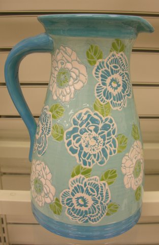
A cute jug for summer drinks.

Time to change your curtains for
something lighter and brighter!

Square glass pots in a range of happy colours.

This summer duvet would look great with..


...these lights.

Blue and white - a spring classic.

Here's that combination again, this time on a toss pillow.

Looking for a funky table lamp? Look
no further!


Here's a close up of the lights. They look really
sharp with the graphic black-and-white wallpaper
in the background.

Friday, 29 March 2013

Design for the way we really live

Hurray for tulips and other cut flowers!
As the delicate blossoms of my white orchid quietly fall to the floor, I'm starting to get it: orchids simply aren't for me.

In fact, very few potted plants are for me. Only the sturdiest ones with lots of survivor instinct seem to make it past the one year mark. Lucky me then, that I love cut flowers so much! I'll just fill my home with lovely fresh flowers instead. That way, I'll be decorating around who I am and how I really live, instead of according to preconceived ideas about how "it should be".

It's like the homeowner who, despite current trends, forgoes open storage in the kitchen, because they know they won't be able to keep the shelves looking tidy. 

Or the couple who converts a formal living room into a home theatre, because when they entertain, everybody gathers in the kitchen anyways, and watching movies is what they love to do.

Self knowledge is half the battle when it comes to design. So this Easter, colourful bouquets of cut tulips and lilies adorn my home. I hope you, too, have found your ideal way to celebrate the weekend! Have a lovely Easter!

Friday, 22 March 2013

Welcome spring into your home

Photo: Bemz.
Spring is here - at least on paper. No better time than now to start thinking about how to adapt our homes to longer days, warmer temperatures and relaxed living. Because when spring finally arrives, we want to be prepared!

Here are five ways to put yourself and your home in a spring spirit:


1) Switch accessories. Let your toss pillows, place mats, lights, throws and other accessories reflect the change of season. Greens, yellows, pinks and oranges are happy colours that are often associated with spring and summer. Try muted tones of these hues if that works better with the present decor of your home. Do you have a slipcovered chair or couch? Make sure you have two different covers to alternate between, according to the season. Your home will always feel alive and fresh.

Yellow and grey, what a great combination!


2) Light underfoot or "bye, bye" rugs altogether! Bare floors are more conducive to spring and summer living. The soft and warm feeling underfoot that we craved during long winter months is no longer necessary. So remove your heavy, dark rug, or replace it with a simpler alternative in a lighter colour. A striped cotton rug or a sisal feels right for the season.

Photo: Oliver Yaphe.

Liess Interiors. Photo: Houzz.

3) Bring in nature. Once spring is here, there will practically be an explosion outside, of colour and scents. In the meantime, let's enjoy the bare, or nearly budding, trees that surround us. A few, well-selected, tall branches in a glass vase look sculptural and artistic. Leave lots of empty space around the vase, for a dramatic impact.

Contemporary Living Room by Jessica Helgerson
Interior Design. Photo: Houzz.

4) Edit, clean and organize. I've said it before and I'll say it again: only keep what you really love, what helps you in your every-day life, and what adds to the beauty of your space. Remove the rest! When you're done editing, give your home a thorough scrub, starting with the kitchen. Organize your pantry and make room for light summer meals. 

Photo: Houzz.
5) Celebrate your fresh and happy space! Sit down with your favourite drink and pat yourself on the shoulder. You're ready. Now we'll just have to wait for spring to knock on the door...

Friday, 15 March 2013

Is your reno really an investment?

What the three interviewed realtors agreed on: You only get one
chance to make a great first impression and it starts at the curb!  
Should we renovate the kitchen, install a hot tub or repaint the whole house? These are typical questions for anybody planning to sell their home. And while some updates clearly give a good return on the investment, far from all renos do. In some cases, they can even reduce the value of your home!

To know which updates are worthwhile from a resale perspective, and which ones aren't, I asked three local real estate agents for their input. Here are their respective lists of DOs and DON'Ts:


Jacqueline Liddle, Sales Rep., Remax Legend Real Estate

DOs:
1) Any upgrades to a kitchen. If you can't redo the entire kitchen, or the cupboards are still in good shape, I would suggest updating the countertop.


2) New Windows. If your windows are 20+ years I recommend replacing them. Buyers see this as a big cost moving into a home if they know the windows need to be replaced within 5 years. New windows increase the insulative value of your home which also shows better heating costs on your utility bills to potential buyers.


3) Curb Appeal. Most Buyers search mls for listings, then call their realtor to set up a showing after they have done a drive-by of the home. You want to make sure that after the drive-by, they pick up the phone and call their realtor to book a viewing.

DON’Ts:
Interlocking brick driveway. It is difficult to get the value back when you are comparing your property to another down the street and yours is at a higher price because of the interlocking brick driveway.
 

Pamela Baril,  Broker, Century 21 

DOs:
1) New front doors and garage doors are a great investment in curb appeal.

2) Kitchen, the heart of the home. If you don't like it, potential buyers probably won't either. Prices have come down considerably so replace the cabinets or reface if necessary.

3) Bathrooms. Moms don't want to put their babies in a spotty old tub! Acrylic tubs or covers for the existing tub are great options. Toilets are relatively inexpensive as are trendy new vanities and mirrors.


DON’Ts:
Pools and hot tubs are very personal amenities that appeal to some but, not to others. They are also costly to upkeep and can bump up the hydro bill.


Lenka Eberhardt, Sales Rep., Royal LePage North Bay Real Estate

DOs:
1) Update lighting fixtures.

2) Update kitchen and bathrooms. You may not have to do a total remodel. Sometimes just replacing an outdated vanity or old appliances with shiny new ones will do the trick. Stick to neutral colors (white fixtures for bathrooms). Keep the color scheme light and neutral.

3) Exterior elements: a thick, green lawn, repair heaving walkways and steps and an updated front door are sure ways to increase your home's bottom line.

 
DON'Ts:
1) Luxuries such as swimming pools and saunas do not add value.

2) New windows do not add much to resale value unless they are broken. Clean them up and make sure they are working properly.

3) Laying new flooring such as expensive hardwoods and marble will not get you more money on resale.

4) Central air conditioning is considered a luxury item. While it’s nice to have, it won't affect your bottom line.


And what can somebody on a tight budget do? More about that in a future post! In the meantime, I'd love to hear what you have done to increase the resale value of your home. Share your stories in the comments field!


Friday, 8 March 2013

Feminine vs. masculine design

Photo: House Beautiful.
I will never forget the face of the shop owner: huh, she wants what? I had commented that I was looking for something less "masculine" than the striped rug in muted colours that he was showing. He was completely at a loss. To him, "masculine" and "feminine" design meant nothing. How little did he know!

Shape, colour and material will affect if objects in our surroundings read as "feminine" or "masculine". Anybody wanting to achieve a "gender-neutral space" - one where both men and women feel equally comfortable -  should make sure that there is a good balance between feminine and masculine vibes.

Stripes, leather, corduroy, boxy furniture, dark colours, wood and fireplaces read as "masculine". Soft textiles, rugs and furniture with curves or irregular shapes, pastels and light colours, mirrors and flower arrangements are examples of feminine features.

There are ways to "play up" or "play down" objects' "gender", but more about that in another post. For now, let's look at some typically feminine spaces, and let's congratulate all wonderful women out there on International Women's Day!

Photo from Houzz.
 
 
Photo from Houzz: Traditional Bedroom design
by Little Rock Interior Designer Tobi Fairley
Interior Design


Friday, 1 March 2013

Energy efficiency and your home

Hello March, bring on spring! Many of us are yearning for milder temperatures now - and the lower energy bills that they entail! And while there are many ways to conserve energy in our existing homes and businesses, it's with new construction that the largest savings can be made.
 
One way to improve energy performance is through Passive House buildings. Sophie Blain-Rogers of the company Green Leap in Callander is a big advocate of this approach to design and construction. 
"Homeowners would save a great deal on their energy bills and they would be more comfortable and proud in their homes", she comments.
 
The design fundamentals of Passive House buildings include specifications for building shape, orientation and surface area, passive solar gains, advanced windows, insulation and ventilation. Read more here. The Canadian Passive House Institute talks about energy performance savings in the range of 80 to 90 % compared to conventional Canadian construction. Well, that's what I call savings!

Thursday, 21 February 2013

Pantone's Emerald is a gem!

A few weeks ago we talked about Lemon Sorbet being the colour of the year for 2013... But the story doesn't end there. Of course, every colour-related company with authority wants to launch its own selection. For Pantone, the world-wide provider of colour systems and standards, the choice was a beautiful green: Emerald. It is described as "a color of elegance and beauty that enhances our sense of well-being, balance and harmony".


In colour theory, green is known to be the most universally accepted colour. Being "Nature's neutral", it's a colour that goes with everything, and it's an easy colour to live with.

There has been a tendency towards bluish-greens and yellow-greens in interior design during the last few years. Emerald is an example of the former. As you can see below, it combines especially well with other greens and blues, as well as with neutrals.

What shade of green is your favourite?


Thursday, 14 February 2013

Red rooms for Valentine's


Red works wonderfully as an accent wall, as seen
in this crisp kitchen by Zero Energy Design.
Turn up the colour thermometer at home with eye-popping red! Dramatic and strong, red calls for attention and infuses a space with life and energy. But don't go overboard! Painting all the walls in a room this colour is often overwhelming. An accent wall and a few well-selected accessories are often enough to make a statement. Let these red interiors from Houzz be your inspiration for a lovely Valentine's Day!
 
Graphic artwork in red. Simple and effective.
Photo by Elliott Kaufman.
Red combined with its complementary colour
green creates a vibrant and happy corner in
this home.  Modern Living Room design by
Design.
The neutral backdrop in this dining room makes the
red chair and artwork stand out. The red warms up
the space and gives it a touch of drama. Traditional
Dining Room design by Orange County Design-build
 

Try red on your porch door! Contemporary Porch design
Red is an invigorating colour and best used sparingly
in a child's bedroom, where you want the little one to
sleep. For a playroom, though, it's another situation.
Red together with light blue or turquoise makes for
a charming combination. Contemporary Kids design


The attraction of this kitchen is in the red stools
and red accessories. Design by TreHus Architects
and Interior Designers.


More red chairs around a kitchen island.
How do you like them with the rich green
walls? By Camilla Molders Design.
A romantic guestroom with a healthy dose of red.
Interior Designer Z3 Diseño.
 

An eye-popping colour such as red indicates
"this is the front door", and helps guests find
their way to your home. Modern entry
design by Los Angeles Architect Paul Davis
Architects PC.

Red is an enveloping, warm colour and can work
well on the walls in a reading room/library, a cozy
TV room or any other room that you want to keep
dark. Traditional Home Office design by San Francisco
Architect Gast Architects.

Friday, 8 February 2013

Cord management with a spin

"You've got to accentuate the positive. Eliminate the negative." Do the words sound familiar? The lyrics from the song with the same name are also great guidelines when it comes to interior design.

If something is beautiful in our spaces, we want to enhance it (with lighting, colours, mirrors, frames).

If something is not so pretty, we will try to eliminate it, or at least camouflage the unsightly feature. 

Electrical cords definitely belong to the latter category, and it's hard to get away from the messy tangles they create. But with these clever cable organizers it's getting easier. Click the link for each item for more info.


seldom-used devices at check behind the
work desk. Out of sight, out of mind.