Monday, 23 April 2012

Choosing the right blinds

Cellular, pleated, roman, rollers... So many choices, so many decisions! Selecting the right blinds for your windows can feel overwhelming. Here are three considerations to get you started:
Vertical blinds in a contemporary space. Think about how you
want the blinds to stack; to the right, to the left, or even in the 
centre in some cases. Photo: Levolor.
1) Determine a budget for your blinds. Prices range from under $100 to around $600 per window, depending on size and materials.

2) Be clear about the purpose of the blinds. Are they primarily for privacy, for light control, or for that last decorative detail that will make your room shine? Maybe your are more concerned about reducing energy costs, or about blocking damaging UV rays from your furniture?

3) Horizontal or vertical? Consider the size and shape of the windows and the room that the blinds are going in. Horizontal blinds will visually broaden narrow windows and rooms. Vertical blinds will be a welcome break if your room already has many horizontal surfaces, such as long shelves, or if the ceiling is low.

Input from: Factory Blind Outlet in North Bay.
Vienna Sheer Horizontal Shade from Elite Window
Fashions. Consider remote control options or cordless
shades when child safety is a concern. 

A patterned roman shade looks clean and
fresh in this contemporary kitchen. Photo: 
Levolor.

Top down/bottom up blinds allow you 
to adjust the top independently from
the bottom, letting sunlight in while
maintaining privacy. Photo: Levolor.
Natural woven shades provide warmth in this
cottage kitchen. Photo: Levolor
Panels like these from Elite Window
Fashions are a stylish window treatment 
option...

...they can also work as a room divider.
Photo: Levolor.

Monday, 16 April 2012

Smart furniture favourites

Use console tables for vignettes (see
Some pieces of furniture are just ingenious! I'm thinking of furniture that does double duty and that can easily be moved around in a room. Console tables, pouffes and nesting tables all fall into this category. I saw some good examples of these versatile pieces at the Great Room in North Bay last week. Here are tips on how to use them:

Console tables: The typical console table is narrow, long and somewhat higher than ordinary tables. Their often slender profile makes them ideal for displaying beautiful objects on. They can also be used as a bar, an extra table for food when you have big gatherings, or as a "catch-all" surface in a hallway. 

The same console table reflected in
a stylish, round mirror.
I love how the candleholders pick up
the blue from the table.
Nesting tables: You can never have enough small tables it seems, especially when you are entertaining. Nesting tables can be neatly tucked away when you don't need them; clutter control 101.
I know, this is not a nesting table. 
But I just had to show this cool,
sculpted stool/table from the Great 
Room.
Nesting tables with a slightly distressed 
look. They work beautifully with the 
console table above.


Pouffes: The casual cousin of ottomans. Can be stored under your console table! Pull them out whenever extra seating is needed. They add texture and warmth to a room.
From Wikipedia: "Tuffet, pouffe or hassock are all terms for a piece of furniture used as a footstool or low seat.[1] It is distinguished from a stool by being completely covered in fabric so that no legs are visible. It is essentially a large hard cushion that may have an internal wooden frame to give it more rigidity. Wooden feet may be added to the base to give it stability, at which point said item becomes a stool or a footstool. If the piece is larger, so that storage can take place inside it, then it is generally known as an ottoman."

How do you like the idea of some pouffes in your space? Too casual? Just right? 

Saturday, 7 April 2012

Purple Easter inspiration


Lavender, mauve, fuchsia, purple, aubergine, plum; different shades and intensities of blue and red mixed together. This colour family was popular last fall and continues to feel right for the spring, in clothing, accessories and at home. (At Stix and Stones fashion show last week, I saw absolutely stunning knitted pieces in bright purple!).

Introduce a wow factor in your traditional home with a shiny, purple area rug (inspiration: Marilyn Denis's dining room, House and Home). The colour looks fantastic with gold and brass, and combines well with sophisticated greys.

Or why not try a pale lavender slipcover in your cottage? Or some funky purple/mauve/plum glass bottles as accessories if you have a more contemporary space?

And for all of you who want to play it safe: the odd accent pillow will also do the trick. Have a lovely, purple Easter!


Photos: Bemz and Designer Fabrics.

Sunday, 1 April 2012

So your style is...

Thank you to all of you who visited me at the North Bay Home and Garden Show this weekend. I enjoyed meeting everyone and chatting about your home design projects.

At the show, I asked visitors to vote for their design style. "Traditional" turned out to be the frontrunner, followed by "Cottage", "Contemporary" and "Eclectic". Check out Houzz to learn more about these and other styles. And congratulations to Lynne L. who won the draw for a design book and a design consultation!

Remember that whatever your preferred style is, the most important thing is that your home feels right for you and the life you lead. Starting this week, I will be at Breault Painting in North Bay on Wednesdays between 3 and 5 p.m. to answer your design questions. I look forward to seeing you there!

Most of you voted for the traditional
style. Photo: House Beautiful.

Monday, 26 March 2012

Trick your eyes with wallpaper


Do you have a room at home that feels small and narrow? Or does a space appear too big and impersonal? Wallpaper can help you camouflage these problems. Here's how:

Narrow room: A horizontally striped wallpaper will visually broaden the room. The horizontal line will also "bring down" a high ceiling.

Low ceiling: Pick a wallpaper with vertical lines to make the ceiling seem higher.

Oddly-shaped room: A patterned wallpaper, like a floral, will remove attention from strange angles and odd shapes in a room. It will also hide imperfect walls.

Small room: Classic design theories call for small patterns in small rooms. However, many designers today claim that big design motifs visually expand a room.

Make a narrow room seem 
wider with horizontal stripes.
Colours: A light-coloured wallpaper will make a small room seem bigger, and a darker wallpaper will make it seem smaller. If you like a dark shade but want to prevent the room from looking to sombre, pick a wallpaper with a nice sheen. It will reflect some light into the room.

Big, impersonal room: Try a wallpaper with a big pattern in a darker, warm colour and with a rough texture. This will visually make the walls "come closer" and create a more cozy feeling.

The sheen and vertical pattern of 
this wallpaper make it a good 
candidate for a smaller space
with a low ceiling.
A floral or any other patterned wallpaper
will camouflage imperfect and oddly-shaped
walls.

Sunday, 18 March 2012

Hello spring, hello wallpaper!

Speak about drama! This large damask pattern 
from Graham & Brown looks amazing coupled 
with coloured glass. 
Welcome spring into your home with cheery wallpaper! I've said it before and I'll say it again: one papered wall is all you need for a dramatic effect.

If you are still unsure if wallpaper is for you, try it in a small space or in a room that you don't use so often, like a hallway or your dining room. Don't go bold if you don't want to. Subtle is also fine. Believe me, there are papers out there for all tastes!

Next week I'll tell you how you can visually change the dimensions of a room with wallpaper. In the meantime, I hope these fresh, clean designs, as seen at Stradwick's and Stewart's in North Bay, will inspire you to take the leap!


This blue-and-white interior with a slightly cottagy feel 
just screams spring! Clarke & Clarke Viva Collection.
And here is the same paper in
warm citrus and grey.


Who says wallpapers are old fashioned? 
Big patterns, especially, have a decidedly 
modern vibe, like this black-and-beige 
floral from Clarke & Clarke's Showstoppers 
collection. 
The same paper in lovely, spring-like colours.
Another blue-and-white paper with a pale 
summer look. Clarke & Clarke's Showstopper
collection.
And here's the same paper in a more contrasting
colour combination. 
For all lovers of pink...

This is a completely different kind of paper,
very graphic and stark. Clarke & Clarke 
Viva collection.
If you prefer a more subtle paper, this
beige on beige with lots of sheen is an
elegant alternative. The paper will be
more or less apparent depending on the
lighting conditions. Graham & Brown.
The same paper in a beautiful turquoise 
and beige combination.


Monday, 12 March 2012

Quilts to last generations


If you read my trend report, you already know that patchwork is in. We find it on textiles, rugs, and... of course our beloved quilts. No wonder; it’s a great way to introduce colour, softness and pattern to a room! With today's many modern, cheerful designs and colour combinations, quilts have a natural space in all kinds of environments. Yours too!

My friend, designer Marika Jonson, has been making contemporary quilts for many years. I chatted with her about her approach to the quilting process:

Q: Marika, where do you draw inspiration from and what determines what your quilts will look like?

A: The environment where the quilt is going is important and also who I am creating for. I always take my client’s preferences of size and colours into consideration, and the tactility in their home. While I sew, I spend hours thinking about the client and incorporating good-luck wishes throughout the project.

Q: You also strive to have the personality of the owner represented in the quilts. How do you achieve that?
A: I always ask the client for a pile of used fabric that has belonged to their family for a long time. I also dive into my own abundance of fabric. Sorting through the piles gives me clues to combinations and contrast that I think reflect the personality of the owner.
Q: What are the next steps?
A: Next, I create a sketch where I decide on format and complexity of the pattern, which in turn leads to arranging fabrics in piles ready to be ironed and cut. I need lots of floor space when I sew and the possibility to leave things as is. That way the inspiration stays with me, from start to finish. 

Q: What should we think about when we buy a quilt?

A: Quality! That's it, it should last for generations. The rest is up to your liking. Do you want an embellished one? Full of contrast or subtle? You decide. 

Speaking of embellished, a selection of Marika's quilts fills this posting, along with three local quilts (bottom) from Three Gables Studio in North Bay.  A feast in colour and creativity!


Sunday, 4 March 2012

Big box Ottawa inspiration

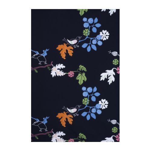
Put fabrics on your walls! IKEA's fabulous, 
big-patterned textiles are ideal for that. Hang 
three different patterns next to each other for
a layered look. At less than $10 per meter you
can't go wrong. The effect? Bold, beautiful and
dramatic!
I love northern Ontario, but have to admit that I jump at any chance to go to the big city. And it's not the crowds and the commotion that attract me. It's the tons of ideas and inspiration I'm guaranteed to get during my urban ventures. Needless to say, when I had the opportunity to visit Ottawa last week, I didn't think twice.

I researched various design destinations, but as it turned out, it was IKEA's new flagship store - the largest in Canada - that became the highlight of this trip.

With their modern, no-fuss approach to design, IKEA continues to be a refreshing source for inspiration. Especially if you're looking for storage solutions and eye-catching design that will not break the bank. The company's well thought-out shopping experience also adds to the appeal. I was especially impressed by the new store's large, sit-down-and-relax area next to the huge restaurant, a mini-movie theatre for those in the family who don't like shopping, and of course the customary cheap and attractive food options and multiple kids' play areas.

In a separate posting, I'll give you ideas on how to repurpose and customize IKEA's product range. For now, I'll show you some of my IKEA favourites:
This transparent, chrome-plated chair
looks slick, and is a great option for 
any space where you want an airy 
feeling.
This fun table has a removable tray.
Practical and stylish!
A great option for compact living. The chairs
embrace the table and don't take up any
unnecessary space. 
This glass table top with a floral pattern makes
office work something to look forward to.

More great fabrics for your walls:
Anything displayed in this funky, red bowl will look tasty and attractive:

Start a collection of colourful glass!
The reflective surface and happy 
green of this piece is sure to call 
for attention.

Does your couch feel oversized and stuffy? Balance it
with this simple, yet elegant chair for an overall lighter 
impression in your room. 

And for extra seating that you can easily stow away, 
why not go for a casual stool made from banana fibre? 
The natural material will give the room a warm, organic 
vibe.