Monday, 12 March 2012

Quilts to last generations


If you read my trend report, you already know that patchwork is in. We find it on textiles, rugs, and... of course our beloved quilts. No wonder; it’s a great way to introduce colour, softness and pattern to a room! With today's many modern, cheerful designs and colour combinations, quilts have a natural space in all kinds of environments. Yours too!
My friend, designer Marika Jonson, has been making contemporary quilts for many years. I chatted with her about her approach to the quilting process:

Q: Marika, where do you draw inspiration from and what determines what your quilts will look like?

A: The environment where the quilt is going is important and also who I am creating for. I always take my client’s preferences of size and colours into consideration, and the tactility in their home. While I sew, I spend hours thinking about the client and incorporating good-luck wishes throughout the project.

Q: You also strive to have the personality of the owner represented in the quilts. How do you achieve that?
A: I always ask the client for a pile of used fabric that has belonged to their family for a long time. I also dive into my own abundance of fabric. Sorting through the piles gives me clues to combinations and contrast that I think reflect the personality of the owner.
Q: What are the next steps?
A: Next, I create a sketch where I decide on format and complexity of the pattern, which in turn leads to arranging fabrics in piles ready to be ironed and cut. I need lots of floor space when I sew and the possibility to leave things as is. That way the inspiration stays with me, from start to finish. 

Q: What should we think about when we buy a quilt?

A: Quality! That's it, it should last for generations. The rest is up to your liking. Do you want an embellished one? Full of contrast or subtle? You decide. 

Speaking of embellished, a selection of Marika's quilts fills this posting, along with three local quilts (bottom) from Three Gables Studio in North Bay.  A feast in colour and creativity!


Sunday, 4 March 2012

Big box Ottawa inspiration

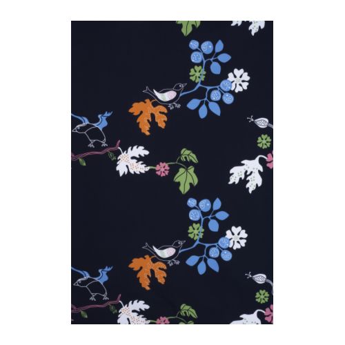
Put fabrics on your walls! IKEA's fabulous, 
big-patterned textiles are ideal for that. Hang 
three different patterns next to each other for
a layered look. At less than $10 per meter you
can't go wrong. The effect? Bold, beautiful and
dramatic!
I love northern Ontario, but have to admit that I jump at any chance to go to the big city. And it's not the crowds and the commotion that attract me. It's the tons of ideas and inspiration I'm guaranteed to get during my urban ventures. Needless to say, when I had the opportunity to visit Ottawa last week, I didn't think twice.

I researched various design destinations, but as it turned out, it was IKEA's new flagship store - the largest in Canada - that became the highlight of this trip.

With their modern, no-fuss approach to design, IKEA continues to be a refreshing source for inspiration. Especially if you're looking for storage solutions and eye-catching design that will not break the bank. The company's well thought-out shopping experience also adds to the appeal. I was especially impressed by the new store's large, sit-down-and-relax area next to the huge restaurant, a mini-movie theatre for those in the family who don't like shopping, and of course the customary cheap and attractive food options and multiple kids' play areas.

In a separate posting, I'll give you ideas on how to repurpose and customize IKEA's product range. For now, I'll show you some of my IKEA favourites:
This transparent, chrome-plated chair
looks slick, and is a great option for 
any space where you want an airy 
feeling.
This fun table has a removable tray.
Practical and stylish!
A great option for compact living. The chairs
embrace the table and don't take up any
unnecessary space. 
This glass table top with a floral pattern makes
office work something to look forward to.

More great fabrics for your walls:
Anything displayed in this funky, red bowl will look tasty and attractive:

Start a collection of colourful glass!
The reflective surface and happy 
green of this piece is sure to call 
for attention.

Does your couch feel oversized and stuffy? Balance it
with this simple, yet elegant chair for an overall lighter 
impression in your room. 

And for extra seating that you can easily stow away, 
why not go for a casual stool made from banana fibre? 
The natural material will give the room a warm, organic 
vibe.

Sunday, 26 February 2012

Creativity in wood


Inspiration and material right outside your doorstep! For designer and craftsman Sean Ledoux that's a reality. The surroundings of his studio, on the edge of a North Bay forest, have everything he needs for his projects. Whether it's a gigantic tree stump or a differently-shaped branch, Sean finds a place for these elements in his highly personalized and unique designs. By harvesting and milling his own material, he has maximum control over its quality and grain. And that's important for a passionate woodworker! Sean's furniture and art pieces are sold to residences and corporations, and can also be seen in a number of public spaces. We are many who have admired the Forest Dreamscape Installations at One Kids' Place in North Bay, where he was part of the team. Take a look for yourself!

There are many small friends to 
discover on the art installations 
at One Kid's Place.
An early piece made from steamed walnut and
elm. The drawer opens from either side. 
A non-traditional approach to the dresser.
A privately commissioned chair for a 
dentist's office. Note the smiling mouth!

Have a bowl or lidded box made from your favourite 
tree! This collection shows some of the vessels Sean 
has created on the lathe. 
Walnut salad bowl.
Dovetail detail.
Frame made from reclaimed wood.
Collaboration with painter Brian Kelley

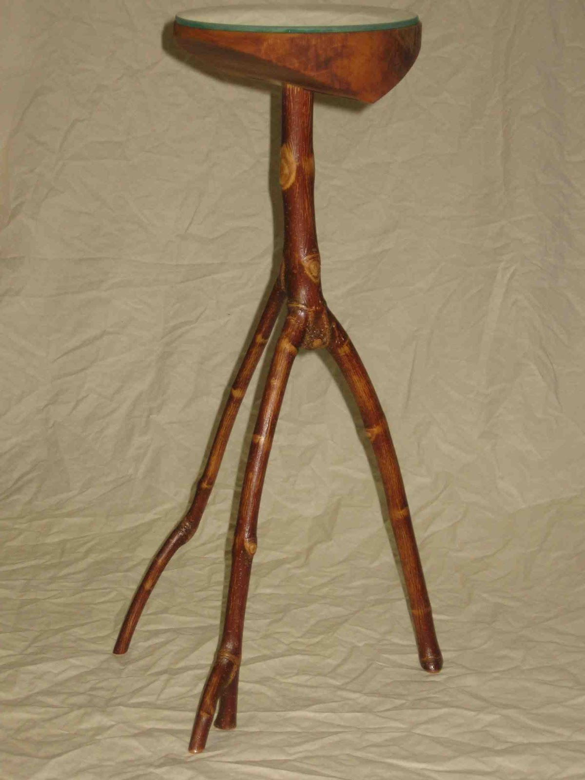
Pedestal table from new line of
furniture.

Monday, 20 February 2012

North Bay Antique Show

50s vibe in a favourite colour combination.
Happy Family Day everyone! The Annual North Bay Antique Show was on this weekend, an event that a "design aficionada" like myself cannot resist. Even if your style is more contemporary, I suggest you keep an open mind about introducing a few old objects into your space. Why? Because they tell a story and are often beautifully crafted. So if you are looking for conversation pieces for your home, and items that add interest, antique stores and shows are good places to visit.

Yesterday, I was mainly drawn to fun patterns, bright colours, and sculptural shapes at the show. Take a look for yourselves!


Bright colours on a white background always look fresh.
A pop of bright blue for your shelf.
Cool kettle with patina.
Nice curves!

This pink collection makes quite a statement.
Add this sweet cake plate to your shabby chic interior!
A delicately embroidered dress can work as a piece of art, either on a hanger or framed.

Wednesday, 8 February 2012

2012 Trend Report


Check out what's hot in interior design this year! You'll find my trend report from IDS12, Canada's largest contemporary design fair, under "Trends".

Tuesday, 31 January 2012

Compact-living solutions

The classic space saver: the Murphy
bed. There were lots of them at the
show. Below you see a few more
examples.

Are you suffering from the small-space-lots-of-stuff syndrome? Then you should pay special attention to your furniture choices and how you organize your space. I attended the Interior Design Show in Toronto this past weekend and it was all about compact condo living. Obviously, northern Ontario is not Toronto, but the challenges are sometimes the same.

My best advice when space is tight is to start with your storage capabilities. If storage is scarce, you have to create space for your belongings in your present environment. Use shelving, furniture with storage, furniture that does double duty, and mobile arrangements that you can tuck away or hide behind curtains. If you can spare one entire wall of a room, you can fill it with shelves. Extend a curtain rod (or wire) the whole length of the wall and let a colourful fabric hide it all. Voilà! You've created storage and a beautiful feature wall at the same time!

Here are a few more ideas, as seen at IDS12. Watch out for my trend report from the show. Coming soon!

Let your furniture do double duty if space it tight.
These cubes actually do triple duty; as side tables,
extra seating and storage boxes. Smart!
This media centre also uses the sides
for storage.
Colourful Murphy beds.


You can actually close the doors to this kitchen
unit, hiding all the gadgets. Or, if you're organized
and have beautiful china you want to display, 
leave them open. Depending on how you display
the objects inside, the unit can act as a piece of 
art in itself.
This bookcase/room divider from cb2 is fun, 
practical and decorative. 

Monday, 23 January 2012

When white is right

White is the perfect backdrop for this
sculptural, wooden railing. The white
also makes the bright pink accessory
stand out. Use different textures and 
materials in your space, and a range 
of whites to avoid a cold, clinical
feeling.

I lived in Spain for many years, and in that country at that time, there was never any doubt about what colour to paint the walls: always white! White was a natural choice, providing coolness during hot summer months and highlighting beautiful architectural features so abundant in that part of the world.

Even if white isn't an obvious choice for us in northern Ontario, it can still be right for your space. Here are ten situations when you should consider white:

1) If your home is dark and you wish to brighten it up.
2) When you want or need a really clean space.
3) If you own a great art collection and want to show it off.
4) When you have colourful, statement pieces of furniture.
5) When your space has many textured and warm surfaces, such as a rough brick wall, wooden beams, or an impressive stone fireplace.
6) If you want a beautiful view to speak for itself.
7) When your home has many interesting architectural features.
8) If you easily get tired of colours.
9) If you have a lot of bright, colourful accessories.

10) When you're working with and are surrounded by colours in your job and want a break from colours at home.

There is a seemingly endless array of whites to choose from, so take your time. Stay away from stark, bright white. Look at other colours in your home and determine if you should have a white with a slightly grey, beige, or any other colour as undertone. Do the sample test described in my previous posting. Links to lists of best-selling whites can be your starting point. Let me know how it goes!

Monday, 16 January 2012

Trying colour options at home

How about a soft blue for your dining room? 
Whyte Blue (HC 143) was chosen Benjamin 
Moore's 2012 colour of the year. It is described 
as "a beautiful, calming blue that has an element 
of heritage and offers grounding rootedness, 
providing comfort and stability".
So you've been to the paint store. With a number of paint chips in hand, you are now ready to make the final decision. Or are you? It's not uncommon to find that colours that looked great in the store look completely different at home. The difference has to do with lighting conditions and surrounding colours. That's why I recommend that you always buy sample cans of your paint candidates before committing to a colour. Many local paint stores now offer these small cans for $5 to $8 per unit, a small investment for making an informed decision.

Try the colours at home. Paint generous samples (about 18" square) of all candidates. Repeat the procedure on different walls in the space. Live with the painted squares for a few days. How do they look at different times of the day? How do they make you feel? How do they combine with your furniture, rugs, and adjacent rooms? Hopefully, there will be a clear winner among your samples!


Wednesday, 11 January 2012

Choosing the right colour

To try a new colour in a room is rewarding in more than one way. Firstly, because the effect is so immediate; even the initial brush strokes give you an idea of the final result. A fresh coat of paint can also dramatically transform a space. So, big impact for a relatively low investment!

But how does one know which colour to choose? Here are a few considerations to get you started:

1) The location of the room. What direction does it face? How much, and what kind of, light does it get? North-facing rooms tend to have a bluish, cool tone. If you want to play up that feeling, opt for a hue with a cool undertone (bluish, greenish). If you want to warm up the room, choose a warmer colour (red, orange, yellow). There are also cool and warm neutrals. Taupe, for example, is warmer than grey.

2) What activities will take place in the room? A bathroom lends itself to a cooler colour scheme (blues, greens). Some people also prefer their bedrooms in those cooler hues for a soothing effect. For any room where social activities will take place, warmer colours are preferable.

3) What colours are present in adjacent rooms? Ideally, there should be a smooth transition between rooms.

4) What colours already exist in the room? Make sure the new colour works with the colour of the flooring, pieces of furniture, and so on.

5) If you still don't know which colour to choose, take a look at yourself. What colours do you look good in and what colours make you happy?

In my next posting I'll tell you how to try different colour options at home. Stay tuned! In the meantime, I'd love to receive your questions about colour... Do you have a painting project on the go?

Tuesday, 3 January 2012

A fresh start

Happy New Year! 

I’ve mentioned before how much I love fresh flowers. They are the absolutely cheapest and easiest way to instantly cheer up a space. Not only do they introduce a pop of colour, fresh flowers also fill the room with life and a subtle scent. Beauty for the senses! 

This New Years Eve I was SO excited when I entered the store to get my groceries. Why? Because in one lonely bin in the flower department stood my all-time favourite: tulips! There they were, in a range of colours, buds barely open and with light green leaves. Fragile and strong at the same time. The ultimate spring flower. With fresh tulips at home, we can trick our minds and fast forward to longer, lighter days. Needless to say, one gorgeous orange-yellow bouquet came home with me. My ideal way to begin the new year! Do you have other suggestions for a fresh start?