Monday 22 June 2015

Happy summer colour combos

Mother Nature has an amazing way of "getting things right". Just look at all the fantastic colour combinations that surround us this time of the year; what a great palette to draw inspiration from!

Check out these tried and true colour combos and how they look in some interiors:

A field of purple, pink and blue lupins, with some
white thrown in here and there to calm down the
intense colours. 
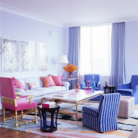
Interior by Jamie Drake.


The ultimate happy summer combo: orange and yellow.
I fell in love with this colour mix when I saw it applied
to two rugs in an old home filled with character and
white-painted floors. One small rag rug was yellow, the
other, of the same size, was orange. Such an effective
and cheery colour statement!

Interior by Amy Lau Design.
Here, the yellow and orange are
combined with navy blue.
Photo: Houzz.


For those of us who love all things simple and crisp,
nothing beats yellow and white!

 
Interior by Jan Skacelik. Photo: Houzz.

Thursday 2 April 2015

In the swing of spring

While we're waiting for this...
As we're anxiously waiting for the ground to thaw, the ice to melt, and some greenery to peek through the fading snow....All we can do when spring is keeping us in suspense is.... hang in there!

Here are some things that will get you in the swing of spring. Happy Easter!


...let's sit down and dream about this.
powder-coated aluminum, at this year's
IDS show in Toronto.


Eames' "Hang-it-all" coat rack with multi-coloured knobs. A design classic! Through Houzz.

Suspended bowl by National Design Collective,
as seen at the Interior Design Show in Toronto in
January.

 
Modern pendant from West Elm.
 

Thursday 26 February 2015

DIY wall art: smart and effective!

DIY "paper wreath", aka Juju hat knock-off.


Wow, that's neat! That was my exact reaction when I saw my client's DIY wall art. So smart, decorative and inexpensive!
 
An old book, a cardboard circle and hot glue were all the materials she used to create this fancy wall decoration. Here's a tutorial on how you can create your own: https://www.youtube.com/watch?v=XNLmdnbud48

Circular shapes in general are great for breaking up the many sharp angles and corners that so often exist in a room. Think: walls, windows, doors and shelves - most of the time they are rectangular or square.

Introduce some round shapes and the space will immediately look more interesting and friendly. 

As with so many things in design, it's all about the mix!


Close-up of my client's DIY "paper wreath". Doesn't it look
a bit like... 
...a fluffy Juju Hat? This African, feather headdress, also called Bamileke,
is a quite popular decoration above fireplace mantels, and is often seen 
in contemporary spaces, and in very vibrant colours. See below.
Photo: Houzz.

         
Photos: Pinterest.

 
Here's the inspiration photo for this post, as seen in the March issue of Canadian
House & Home and Western Living Magazine. I love the textured,circular wall art.
Not to speak of the tiles on the fireplace surround!

Thursday 22 January 2015

Colour beats the winter blues

If you, like me, spend most of your visit at the Royal Ontario
Museum at their aquarium, awestruck by the vibrancy inside,
you know for sure that you're suffering from colour deprivation!
Some call it cabin fever, I call it colour deprivation!

As winter is holding us in a firm grip, let's lift our spirits by springing into colour, and let's do it pronto, no better time than now.

While we're at it, let's also have some fun! That means going beyond the typical addition of accent pillow, colourful throw or bouquet of tulips. I'm talking real projects here with a colourful impact. After all, when we're over it, we can always paint over it.

Here we go:
Paint trim, baseboards and mouldings a cheery yellow!
Photo: Remodelista.
If youre walls have wainscoting, try a vibrant green that goes
so well with this black-and-white scheme. Photo: Benjamin
Moore.
I am craving colour in my windows now! In this
photo the purple/mauve curtains provide nice
contrast to the yellow-green chairs and pillows.
This is such a fun idea, which can be done fairly quickly,
with a lovely, humorous result. Photo: Better Homes and
Here's a variation of the same idea.
Photo: Petitepassport. 
 
Let me know if you have other colourful ideas to beat the winter blues. I'm off to get more inspiring ideas at the Interior Design Show in Toronto. Watch out for my trend report!

Monday 22 December 2014

'Tis the season...


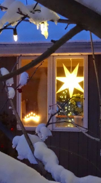
Oh Christmas tree, how lovely are thy branches...

A client asked me a few weeks ago what decorations to use for her tree. "Anything that makes you happy and that mean something to you", I replied, knowing the result might look nothing close to a "designer tree", but instead would be very unique and personal.

I like that approach.

I think a Christmas tree is great for letting your personality shine through and for telling your story, whether it's about travels, hobbies, traditions or culture.

Following my own background, this Christmas I'm all over simple straw decorations, that are such a big part of the Swedish Christmas tradition.

"The real thing", bought in Sweden a few years ago.


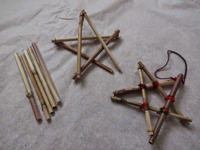
I've made a few pieces using local materials to complement the store-bought ornaments that were already in my tree.

For a beginner straw crafter, I'm pretty happy with the result, which makes for cute little hostess gifts these holidays. Check them out below.

Wishing you Happy and Safe Holidays!
See you in 2015!


Hand-made straw star à la Nina.
Here's another shape I tried, with added
plumes in the corners.


Materials. I got the straw from the roadside along HW 17,
just west of North Bay. The waxed thread is from Lee Valley Tools
and the wool yarn from Stix and Stones in North Bay.

 
Speaking of Christmas trees, isn't this metal one just the coolest?
Made by Kathleen Atkinson-Hindle. Available at Art on Main.


Friday 21 November 2014

Decorating: knowing when to stop

It's OK to go over board for Christmas. But instead of
decorating the whole house, try it in a few designated
areas. Photo: Livet hemma.
So you've found a great backsplash and now you want to apply it to all three kitchen walls.

And in the living room, you're finally happy with the many colour-coordinated pillows in the couch. (At the same time you're observing how guests perch awkwardly at the edge of the sofa instead of sinking into the sea of softness.)

If these scenarios sound familiar, you might have given in to over decorating. Don't worry, you're in good company; design magazines are filled with interiors like that!

In an effort to make our homes "perfect", it's easy to achieve something that looks overdone and that is not practical to live with. Knowing when to stop takes practice, and is also a matter of personal taste.

To get it right, I find it helpful to take the approach of a film director: a good movie features one or two stars, while the rest of the cast are supporting actors. The supporting actors give the framework and time for the stars to build their characters. Compare it to "breathing room" and space around a stellar feature in a home.

This can also be applied to Christmas decorating. I say: focus on a few rooms in your home, or even a designated corner of a room, and let the jewels glimmer without competition. Does that strike a bell? Will you try it?

In my mind, this is too much of a good thing. I'm talking about the backsplash. I would have applied it to the window wall only, making this the feature wall with the wonderful greenery outside. Photo: Houzz.

Friday 31 October 2014

Going green in 2015

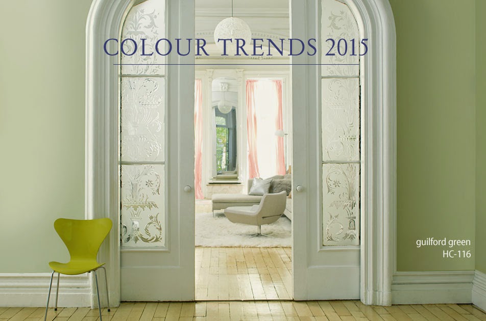
A vibrant, citrus-coloured chair "shakes up" this elegantly contained room,
featuring Guilford Green walls. Photo: Benjamin Moore.


The future is green, at least if you're to believe Benjamin Moore's colour experts. And despite the white fluff that has fallen from the sky today

The paint company recently announced Guilford Green from its "Historic Collection" as the colour of the year for 2015. 

Described as a "neutral that's natural", the silvery green is part of Benjamin Moore's trend palette for next year.

Below are a few interiors featuring the colour. What do you think, is it for you? (All photos: Benjamin Moore).


Monday 20 October 2014

Bright ideas for a cloudy day

With an airy and geometric frame, this fixture
looks more like a sculpture than a light source.
Photo: West Elm.
The weather might be dull, but inside it's sure luminous! Lighting is enjoying a revival today as one of the key ways to set a room's style and boost its personality. 

For contemporary lighting, the trend continues to be "less is more".

Geometric shapes are in focus, making many fixtures look more like sculptures than light sources.

The pared-back industrial style is also still making strides, featuring fixtures with little more than a bulb and a wire. Simple and efficient.

Too simple, you might say?

But easy is good, especially if you're into DIY. And DIY is great if you're on a budget but still want high style. 
 
Ready to challenge your creativity? Below are links to three awesome lighting projects to try on a cloudy day. As always when it comes to electrical work, leave the final installation to a certified electrician. Here we go:
 

1) These fashion-forward fixtures are made of drinking straws, pipe cleaners, spray paint, cord and light socket. You get the idea just by looking at the pictures of the site.


2) To complete the Lindsay Adelman's Hanging Pendant above, you buy a complete kit here ($57) and follow the instructions. Lindsay Adelman's DIY projects also include a chandelier, mobile, desk lamp and sconce. Photo: Remodelista. Here are the parts for the Hanging Pendant kit:


3) Finally, here's a link to making an industrial pipe floor lamp (below).
http://howaboutorange.blogspot.ca/2014/04/how-to-make-industrial-pipe-floor-lamp.html. Make sure to read all the comments regarding enhancing the safety of this lamp.